

In this comprehensive guide, we'll walk you through all the key elements available in the Grigora blog editor and how to use each one effectively. Whether you're writing long-form articles or short updates, understanding these elements is the foundation of great content creation in Grigora.
Accessing Blog Elements
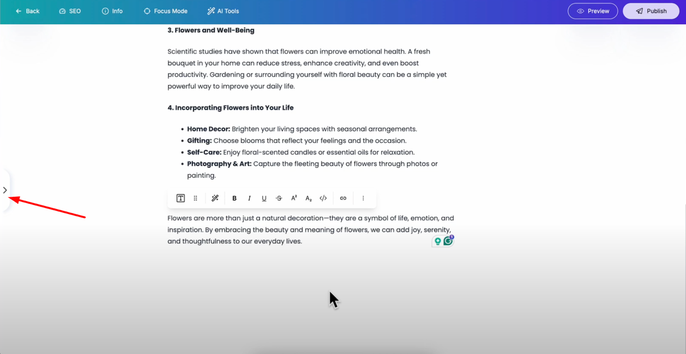
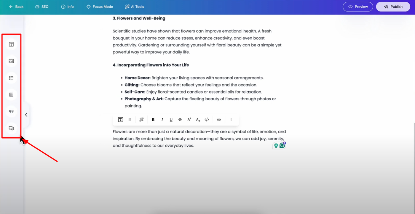
Open your post editor and look for the arrow button on the left side. Click on it and you'll see all the available elements you can add to your posts. Each element offers unique functionality to make your blog posts interactive and attractive.
Text Block - The Foundation Element
The text block is the most commonly used element for your blog posts. After adding it, you can type any content you want and customize it extensively through the settings panel.
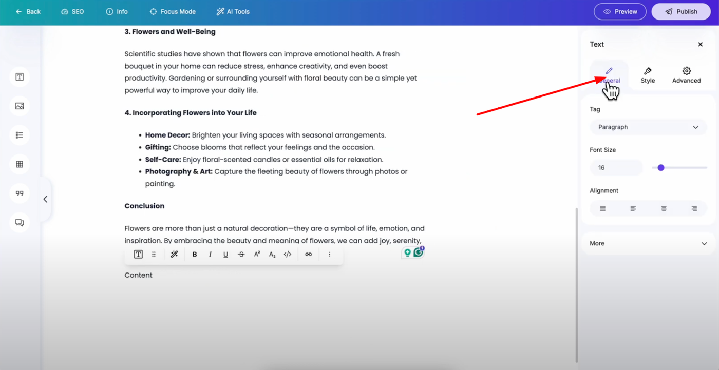
General Settings
Tag: Convert your text into headings from H1 to H6 for proper content hierarchy
Font Size: Adjust using the input field or slider for precise sizing
Text Alignment: Choose from justify, left, center, or right to control text positioning
Font Weight: Change the weight of your text for emphasis and visual hierarchy
Text Transform: Transform your text case (uppercase, lowercase, capitalize)
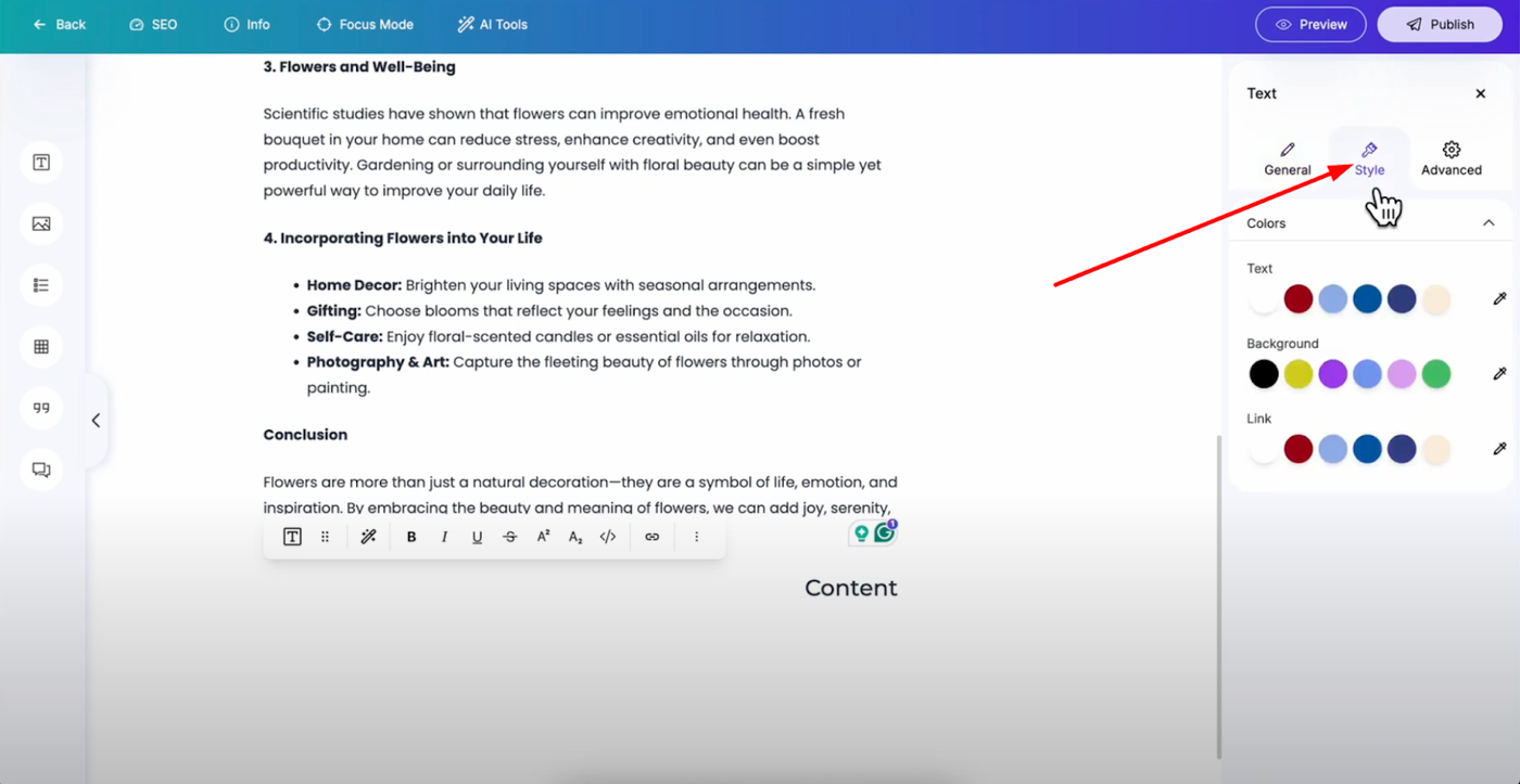
Style Settings
Text Color: Select from available colors or use the color picker for custom colors
Background Color: Apply background colors using the same color selection method
Link Color: Customize link colors to match your brand or design
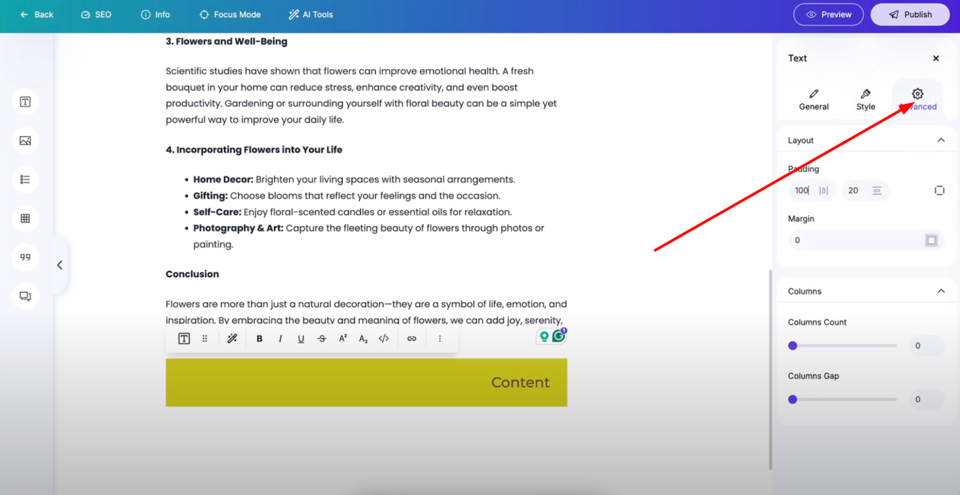
Advanced Settings
Padding and Margin: Apply spacing around your text elements
Columns: Convert text into columns with custom gaps for magazine-style layouts
Image Block - Visual Enhancement
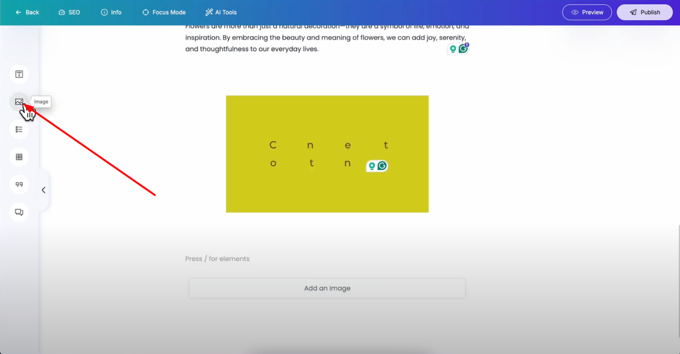
Add images to make your blog posts more attractive and engaging. The image block offers comprehensive customization options.
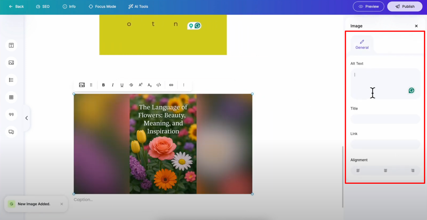
Alt Text: Add for accessibility and SEO optimization
Image Title: Provide descriptive titles for better organization
Links: Make images clickable by adding destination URLs
Alignment: Position your images precisely within your content layout
List Block - Organized Content
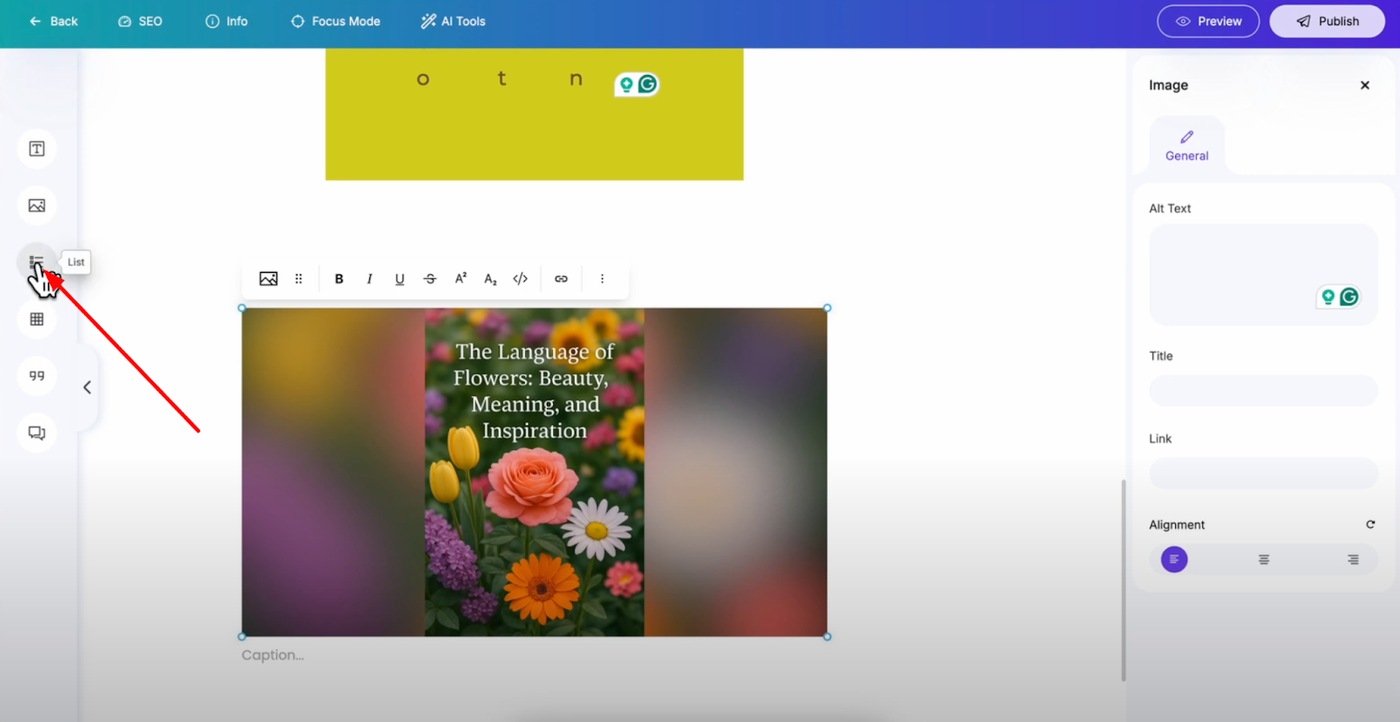
Use lists to organize content in a structured way that's easy to scan and understand. After adding list items, you have extensive customization options.
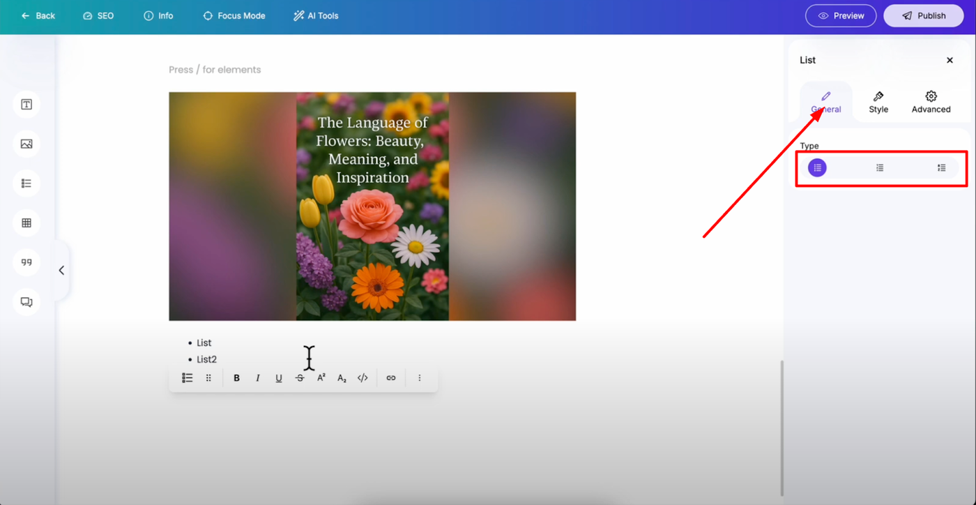
List Type: Choose from bullets, numbered, or custom list styles
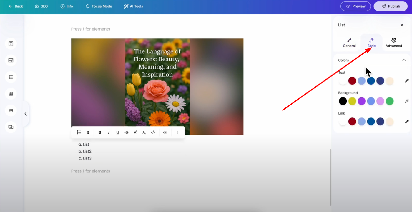
Styling Options: Change colors, background, and link colors to match your design
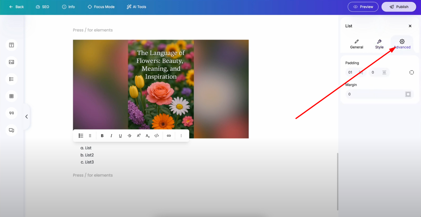
Advanced Settings: Add padding and margins for proper spacing
Table Block - Structured Data
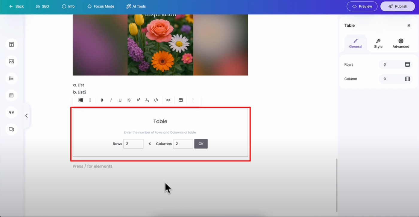
When adding a table, first select the rows and columns. Tables are perfect for displaying structured information.
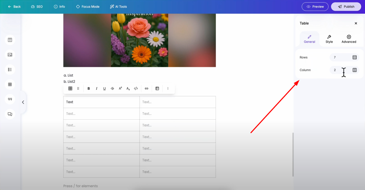
Modify Structure: Adjust rows and columns after creation through settings
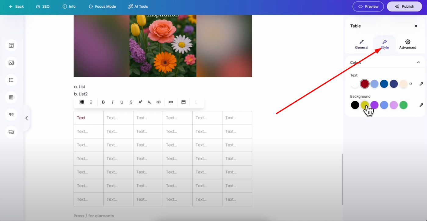
Style Settings: Change text and background colors for better readability
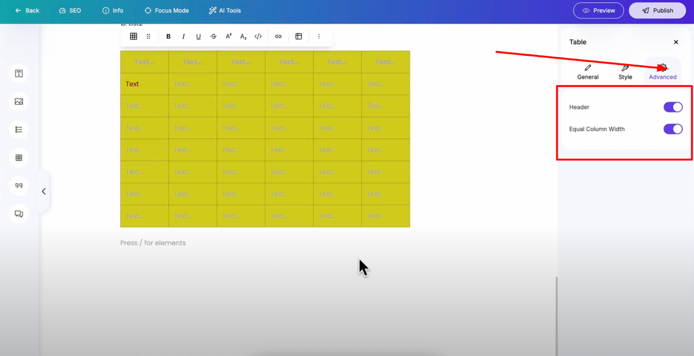
Advanced Options: Toggle to add headers and enable equal column width for consistent formatting
Quote Element - Highlighting Important Content
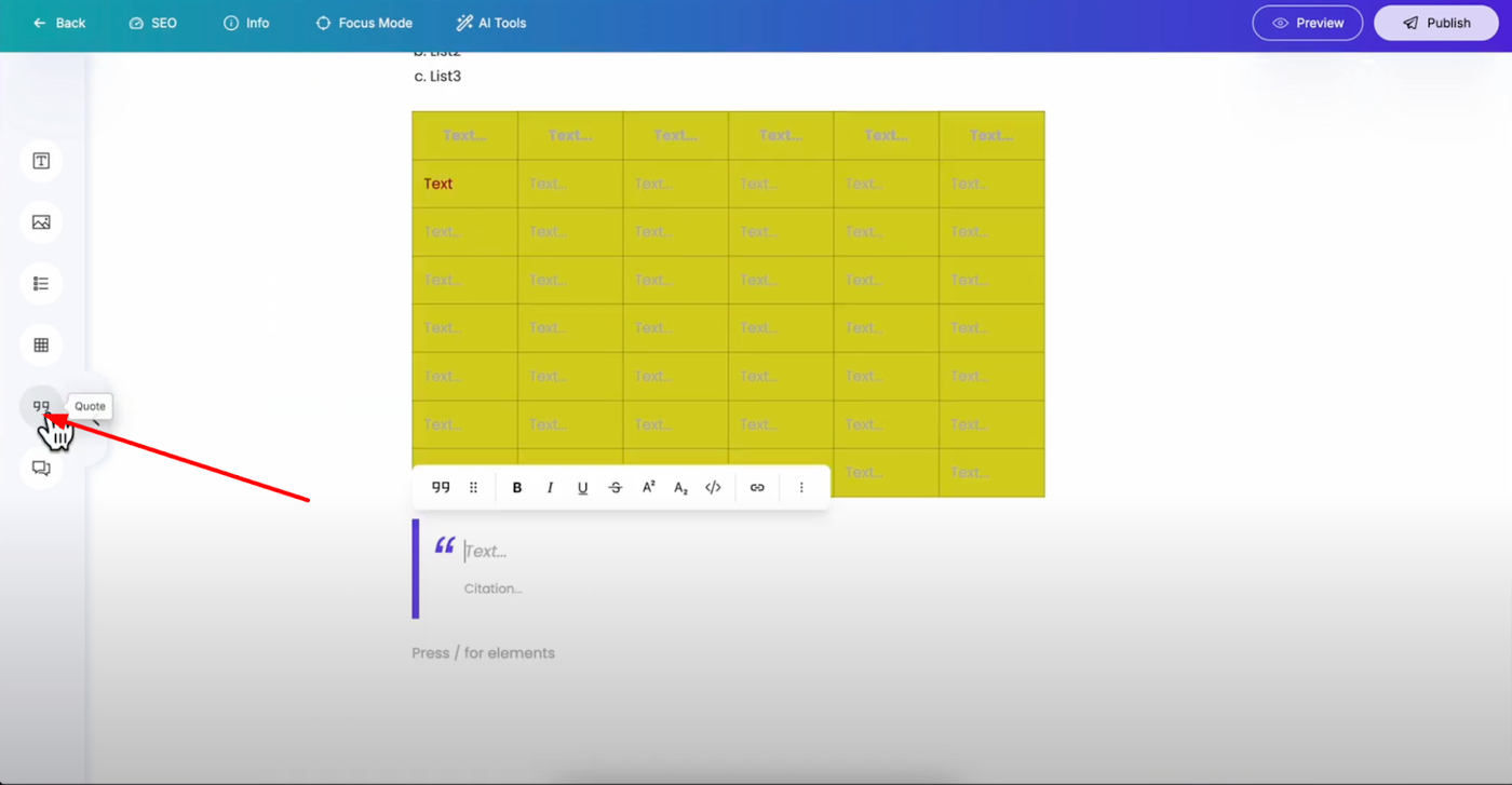
Add quotes to emphasize important information or testimonials in your posts.
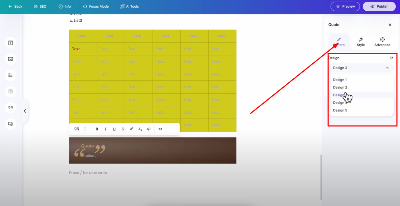
Design Style: Choose from five available designs to match your content style
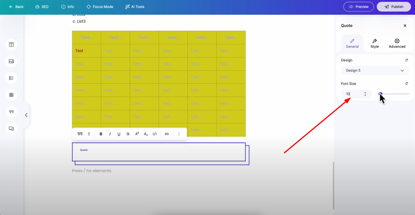
Font Size: Adjust using input field or slider for proper emphasis
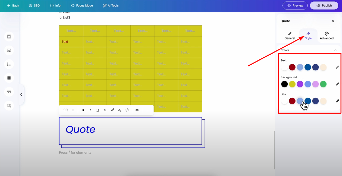
Colors: Customize text, background, and link colors
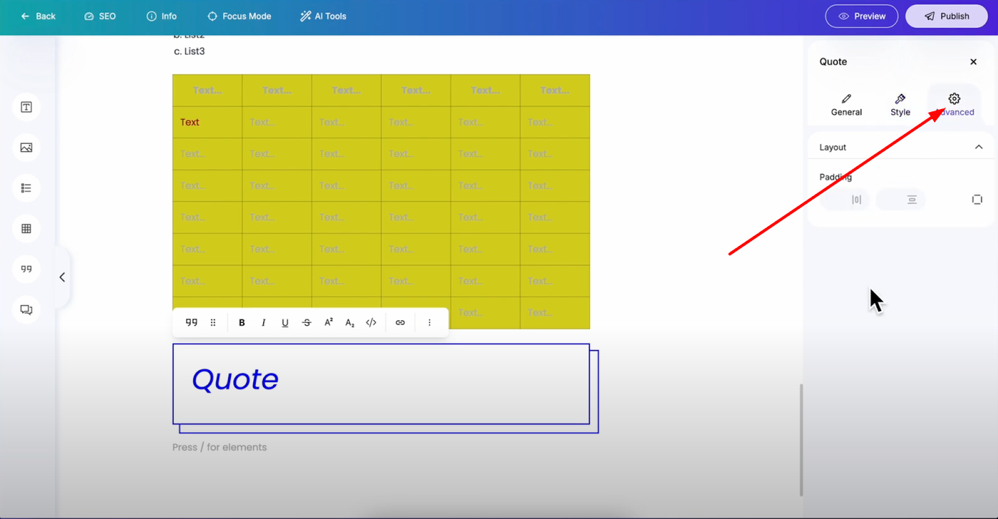
Padding: Add spacing around quotes for visual separation
FAQ Element - Interactive Q&A
Perfect for question and answer sections that improve user engagement and SEO.
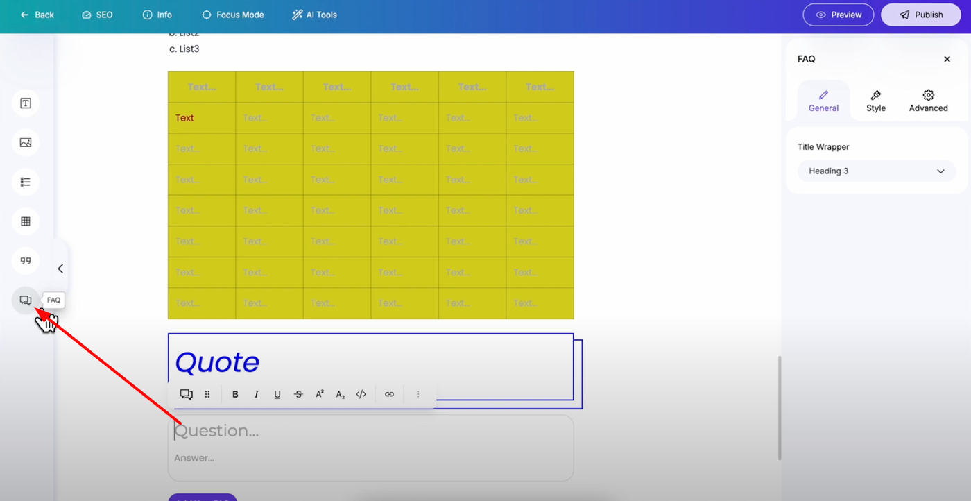
Content: Add your questions and comprehensive answers
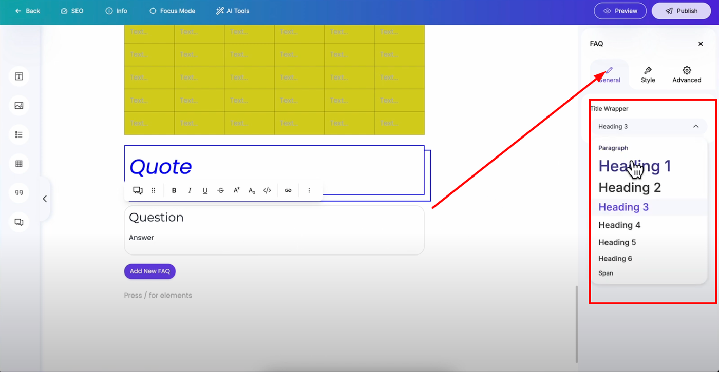
Title Tag: Change to heading, paragraph, or span for proper formatting
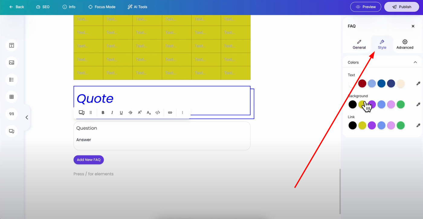
Colors: Customize text, background, and link colors
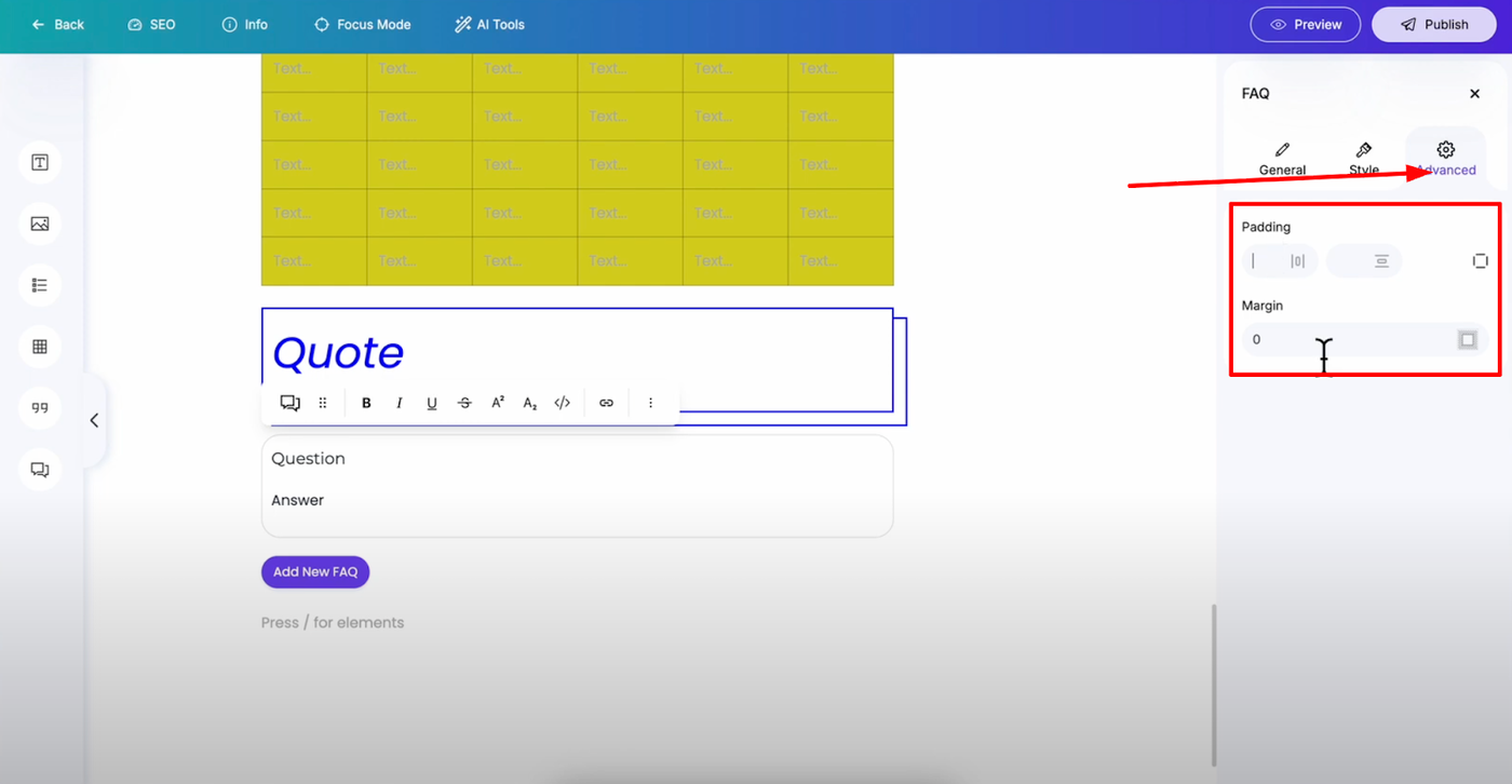
Layout: Add padding and margins for clean presentation
Additional Elements Access
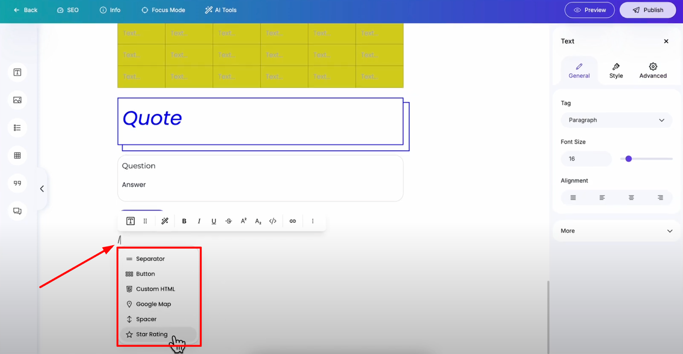
Beyond these main elements, you can access more blocks by typing the slash key (/) in any text block. This opens a complete list of available elements for your blog posts, giving you even more options to enhance your content with specialized blocks and functionality.