

In this comprehensive guide, you'll learn everything about the Column Block in Grigora. Perfect columns are key to professional-looking, responsive websites that structure responsive sections using flexible column layouts and adjust alignment, spacing, and stacking behavior across devices.
Adding the Columns Block
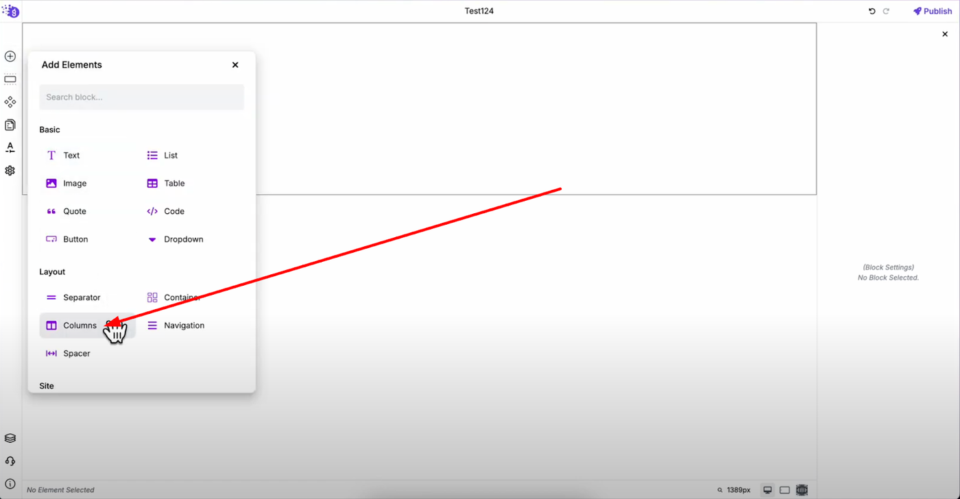
Open the Grigora editor and click "Add Elements" from the left panel. Drag the columns block into your editor to begin creating your layout structure.
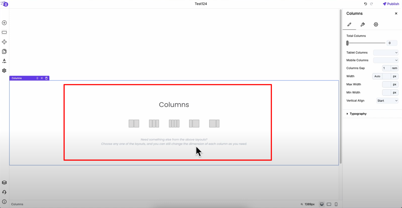
When you add the columns block, you'll see various layout options available for different design needs. Select one based on your requirements — for example, choose the two-column layout for side-by-side content presentation.
Accessing Column Settings
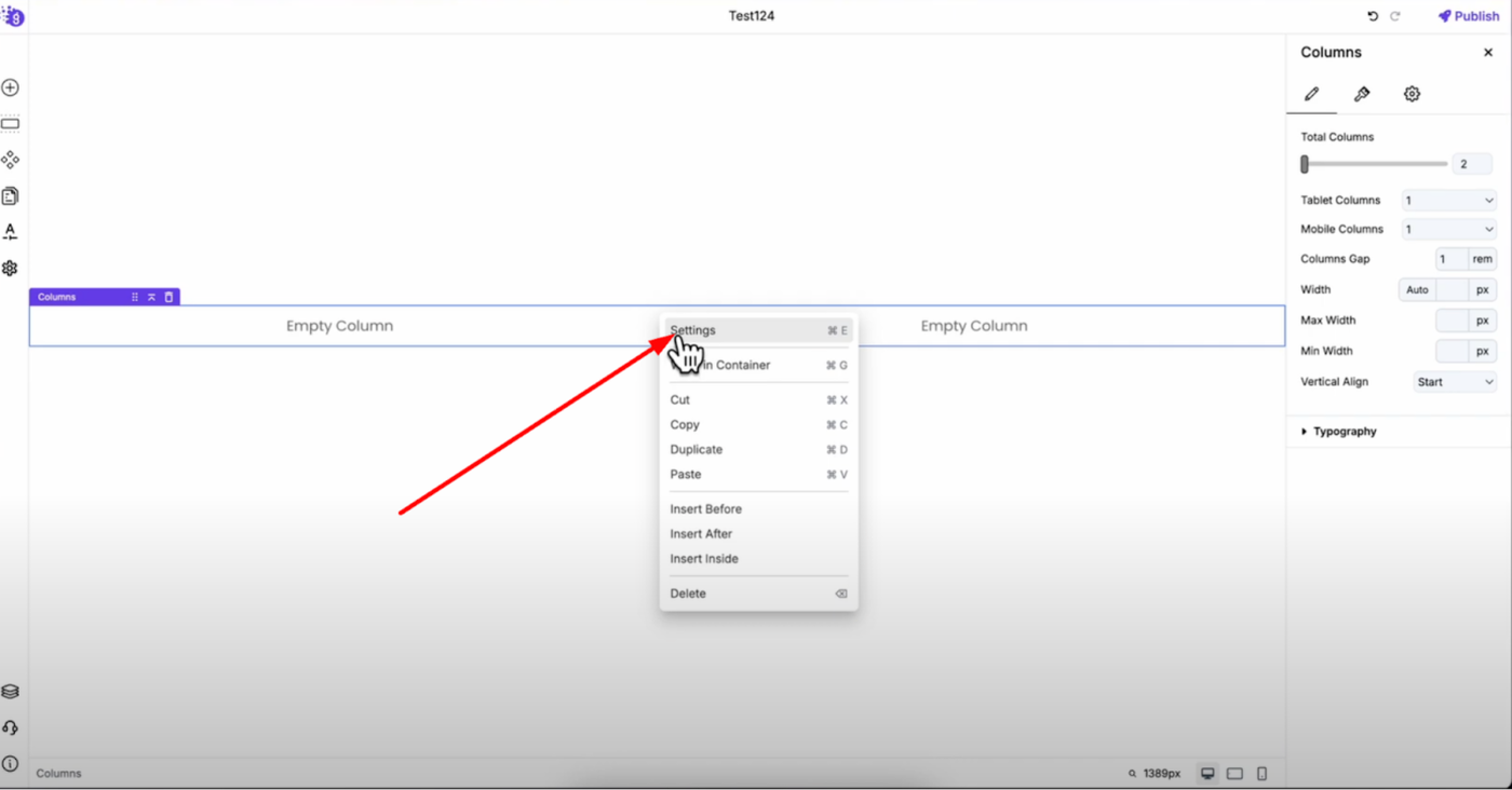
Right-click on the columns and open settings to access all customization options. This comprehensive settings panel gives you complete control over your column behavior and appearance.
General Settings Configuration
Column Structure Control
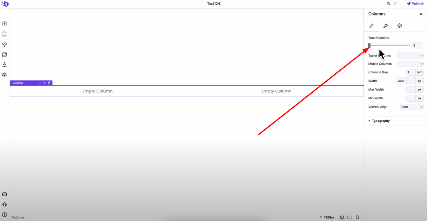
Total Columns: Use the slider to increase or decrease the number of columns. Even if you started with two columns, you can easily change it to three or more columns using this slider for flexible layout adjustments.
Responsive Behavior
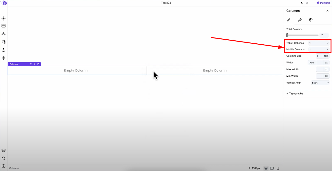
Tablet Columns: Decide how many columns display horizontally on tablet devices for optimal tablet experience
Mobile Columns: Set how many columns appear horizontally on mobile devices for optimal mobile experience and readability
Spacing and Layout
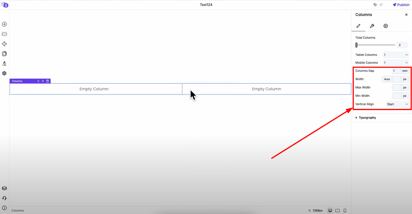
Column Gap: Control the spacing between columns with custom units to create the perfect layout spacing. This is crucial for responsive design and visual hierarchy.
Column Width: Set custom width values or leave it on auto for flexible layouts. Define maximum and minimum width constraints for better responsive control across different screen sizes.
Vertical Align: Align your columns to start, center, or end positions vertically for precise content positioning within your layout.
Typography Settings
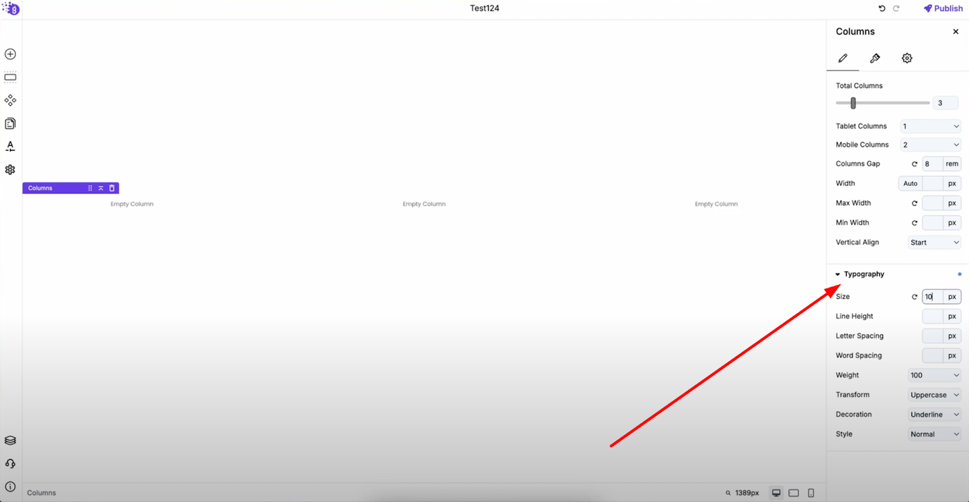
Customize text appearance with comprehensive typography controls including font size, line height, letter spacing, word spacing, font weight, transform, decoration, and style to enhance visual appeal and improve readability across your column content.
Style Settings
Color and Background Options
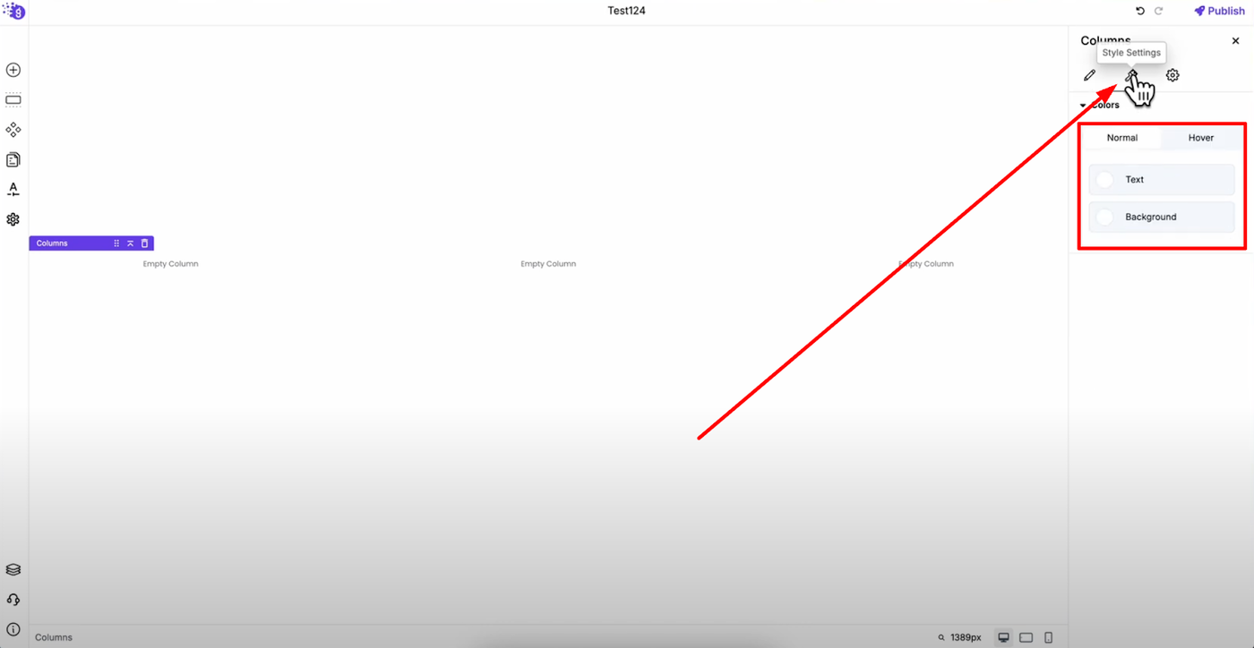
Text Color and Background Color: Apply custom colors that can also be applied on hover with transition timing for smooth interactive style effects that enhance user experience.
Advanced Settings
Layout and Spacing
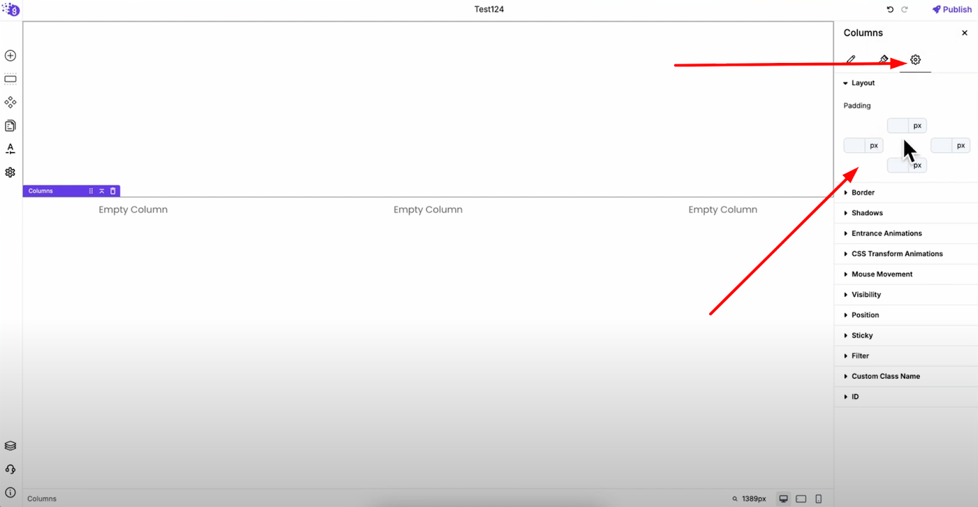
Layout Padding: Apply padding to your columns for proper spacing and visual hierarchy that creates professional-looking layouts.
Visual Enhancement
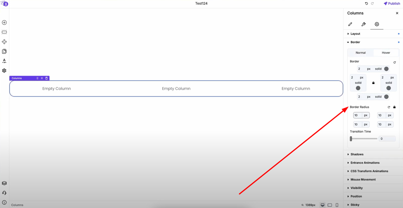
Borders: Add borders and border radius with full hover support and transition effects for polished design elements.
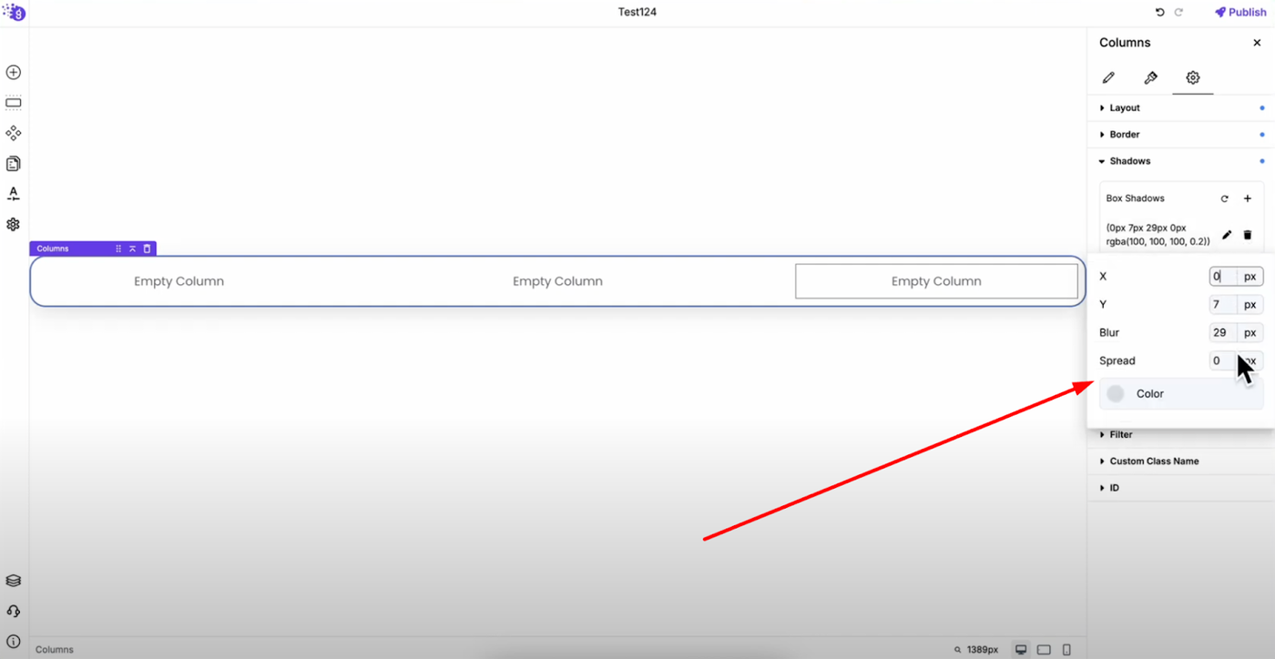
Box Shadows: Create multiple box shadows with options to edit and delete individual shadows for depth and visual appeal that makes elements stand out.
Animation Controls
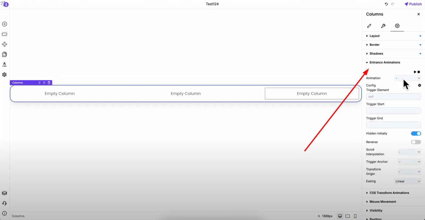
Entrance Animations: Choose from various entrance effects for engaging user experience that captures visitor attention.
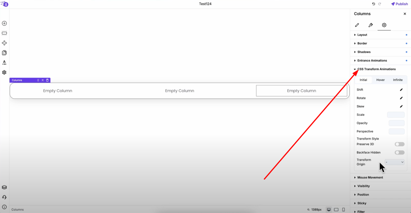
CSS Transform Animations: Advanced controls for shift, rotate, skew, scale, opacity, perspective, and more. Configure for initial, hover, and infinite animation states for dynamic interactive experiences.
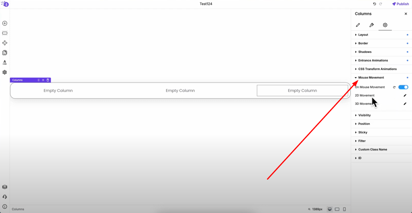
Mouse Movement: Enable 2D or 3D movement that responds to cursor position with same or opposite direction displacement for modern interactive effects.
Display and Positioning
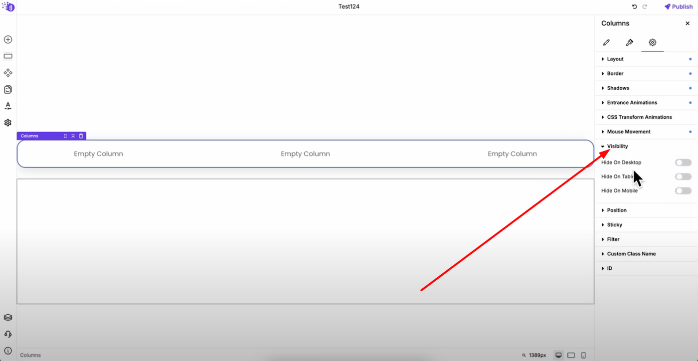
Visibility: Show or hide columns on specific devices (desktop, tablet, or mobile) for tailored responsive experiences.
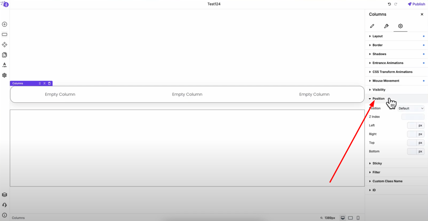
Position: Control positioning with relative, absolute, sticky, fixed, and static options. Set Z-index and left, right, top, bottom values for precise element placement.
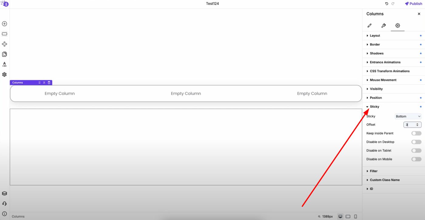
Sticky Behavior: Make columns stick to top or bottom with offset controls and parent container limits. Disable sticky behavior per device as needed for optimal user experience across different screen sizes.
Visual Effects and Customization
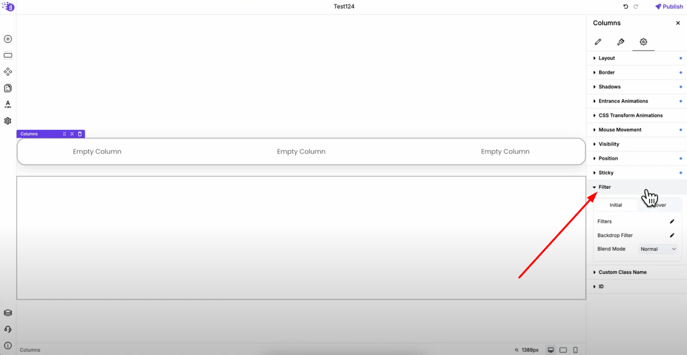
Filters: Apply visual effects to enhance column appearance that can be applied on hover with transition timing for smooth interactive design.
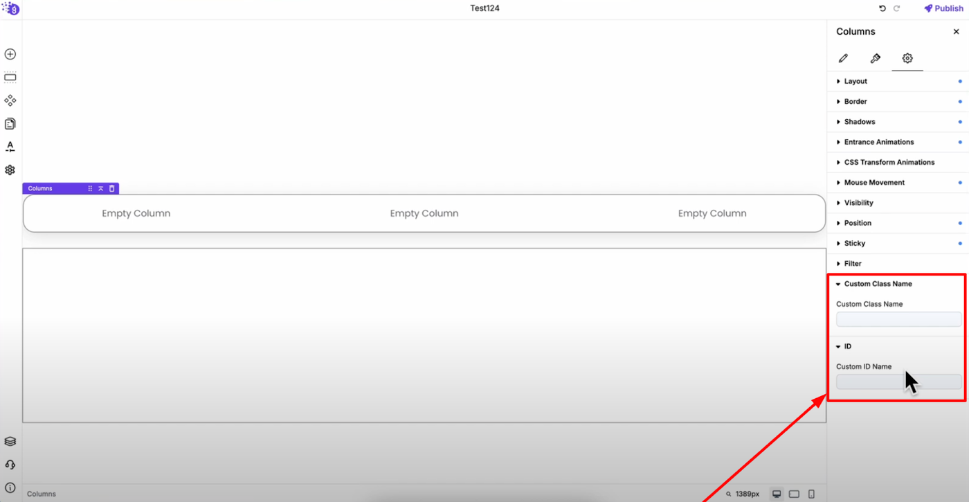
Custom Classes and IDs: Add custom CSS class names and ID names for advanced styling and JavaScript integration, giving developers additional control over column behavior.