

Want your website to look perfect on every screen? This guide will show you how to use Grigora's responsive design tools to customize your site for mobile, tablet, and desktop with no tech skills required. Say goodbye to broken mobile layouts and hello to a truly responsive website!
Previewing Your Responsive Design
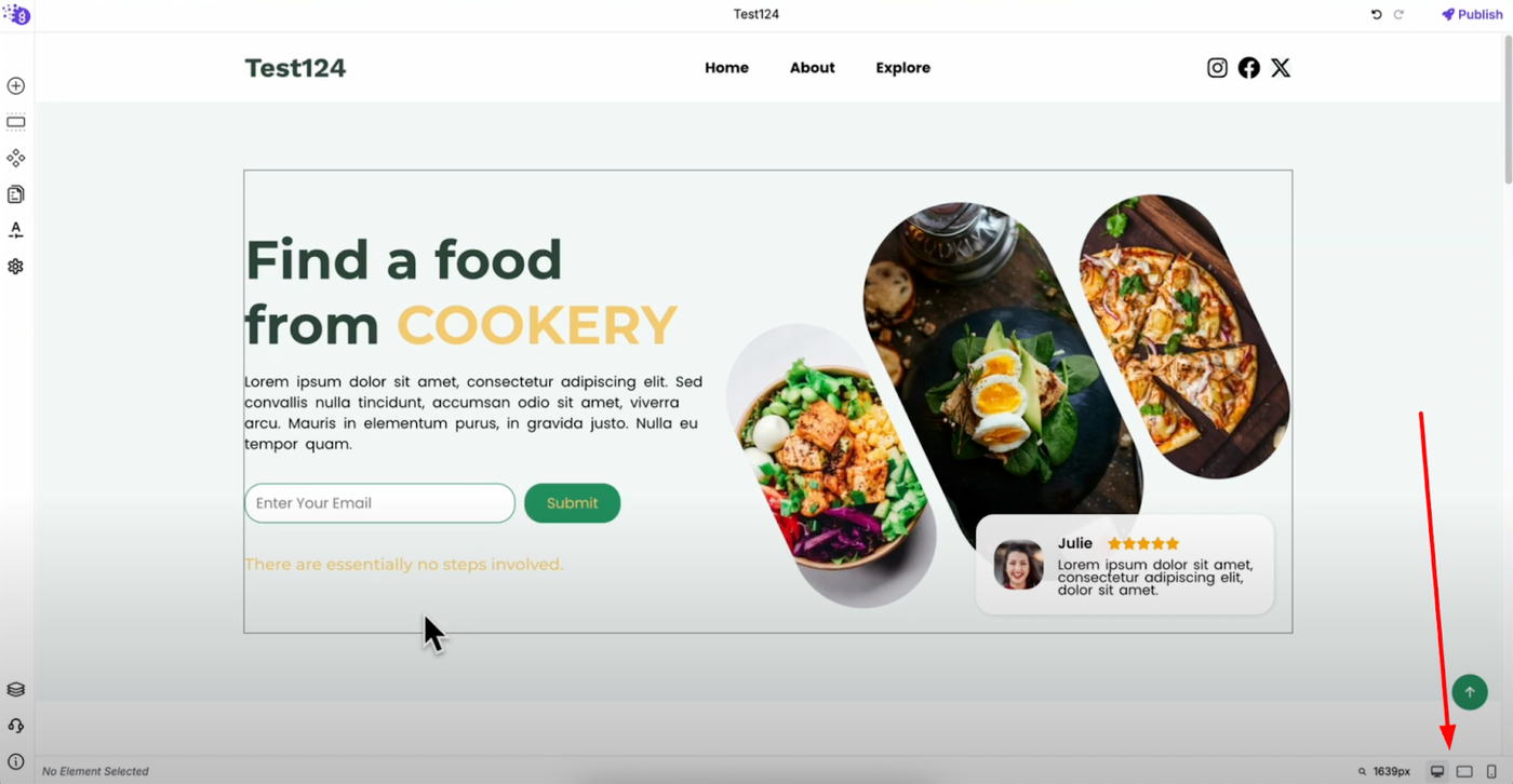
You can preview your responsive design using the device icons at the bottom right of the editor. This powerful preview system allows you to switch between desktop, tablet, and mobile views to see exactly how your website looks on each device before publishing.
This real-time preview capability ensures you can make informed design decisions and catch potential layout issues across all screen sizes during the design process.
Creating Responsive Column Layouts
Desktop Layout Strategy
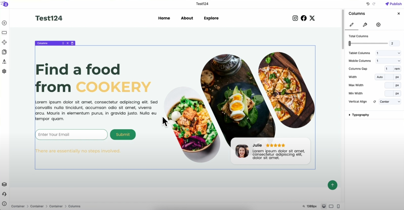
On desktop, create layouts with columns placed horizontally.
Tablet and Mobile Optimization
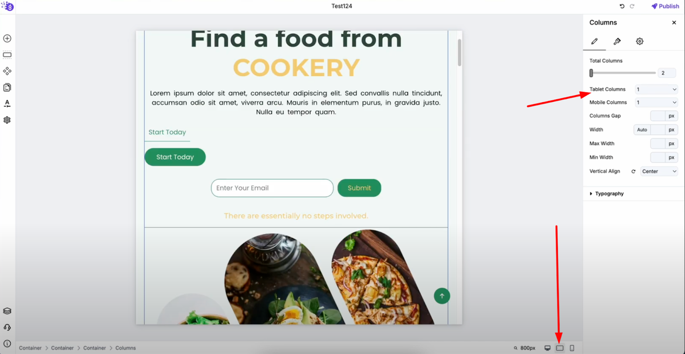
Here's the key to responsive design: On tablet view, instead of showing two columns side by side, set it to display one column at a time. This prevents the layout from looking cluttered on smaller screens and ensures content remains easily scannable.
The same approach applies to mobile devices — one column at a time for better readability and user experience. This stacking approach prioritizes content accessibility over visual complexity on smaller screens.
Device-Specific Element Customization
You can customize elements differently for each device to ensure optimal presentation across all screen sizes. This granular control allows you to tailor every aspect of your design to each device's unique requirements.
Typography Responsiveness Example
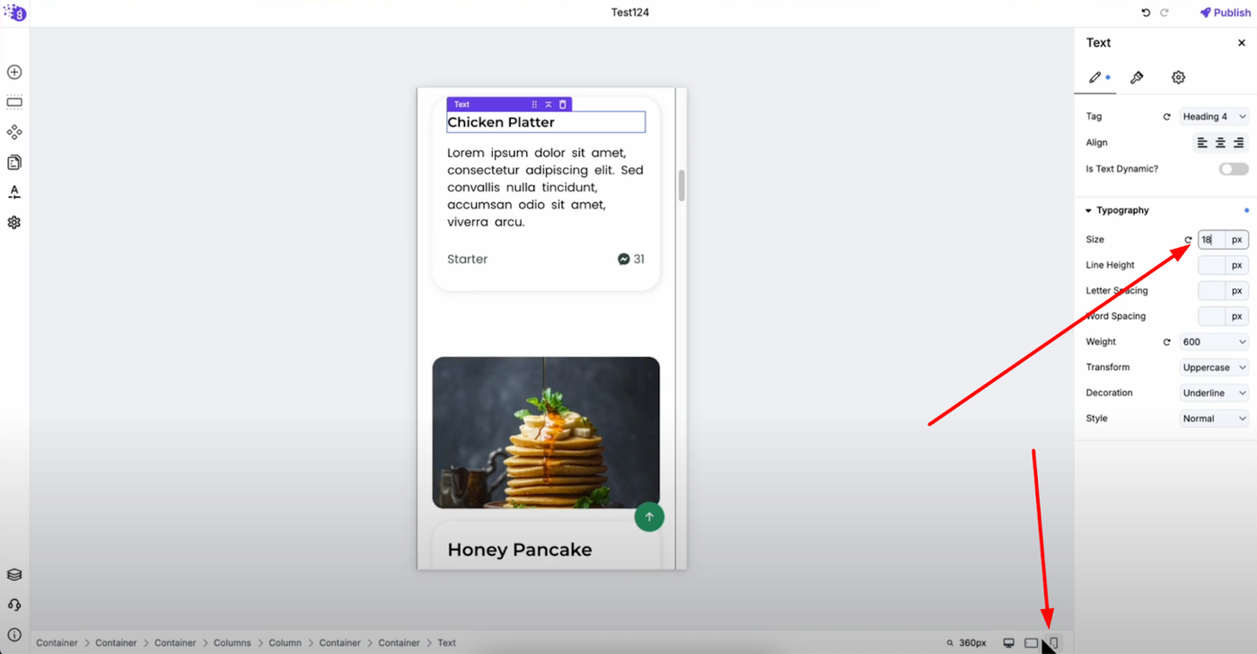
For text blocks, you can set different font sizes:
-
Desktop: 30 pixel font size for maximum impact and readability
-
Tablet: 25 pixel font size for balanced visibility on medium screens
-
Mobile: 18 pixel font size for comfortable reading on small screens
This ensures your text remains readable and appropriately sized on every device, maintaining both visual hierarchy and user experience standards across all platforms.
Universal Responsive Design Application
You can apply this responsive customization to every element in Grigora, including:
-
Text sizes and spacing for optimal readability
-
Layout arrangements for better content flow
-
Element visibility to show/hide content based on device
-
Padding and margins for appropriate spacing on each screen size
Benefits of Responsive Design
This comprehensive responsive approach ensures:
-
Clean, clickable elements on all devices
-
Professional appearance across desktop, tablet, and mobile
-
Improved user experience with device-optimized layouts
-
Better engagement through properly sized and positioned content
Best Practices for Responsive Success
Customize layouts and elements for each device to ensure the best user experience by prioritizing content accessibility, maintaining visual hierarchy, and ensuring all interactive elements remain easily usable regardless of screen size.