

A well-structured menu is essential for helping visitors navigate your site easily and find what they're looking for. This guide will show you how to create professional navigation menus in Grigora that work perfectly across desktop, tablet, and mobile devices.
Setting Up Your Basic Menu Structure
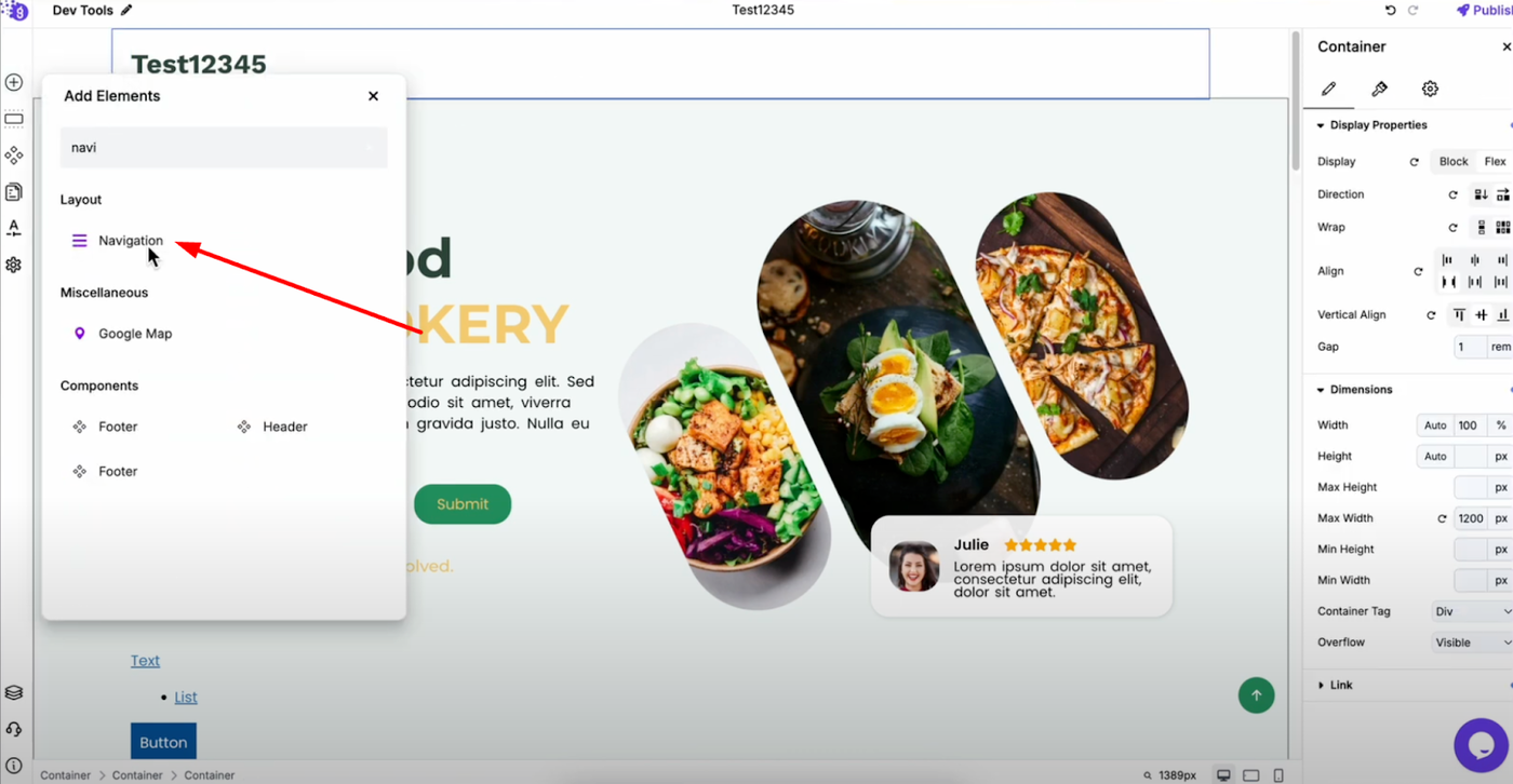
Add a navigation block to your header area in the editor.
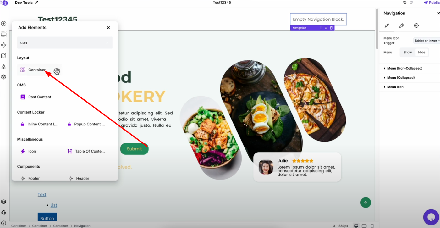
Once added, insert a container inside the navigation block to properly structure your layout. This container will hold all your menu items and allow you to control their positioning.
Adding Menu Items
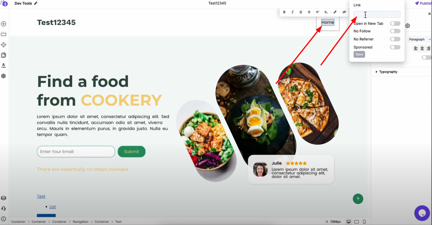
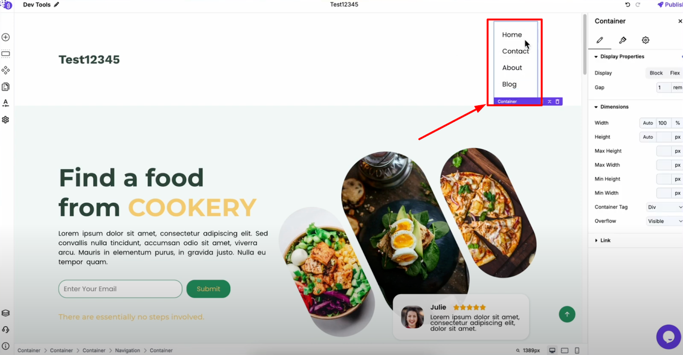
Add text blocks for each menu item you want (Home, Contact, About, Blog, etc.). Double-click on each text block to add links that direct users to the appropriate pages.(Reference to links article).
Creating Horizontal Layout
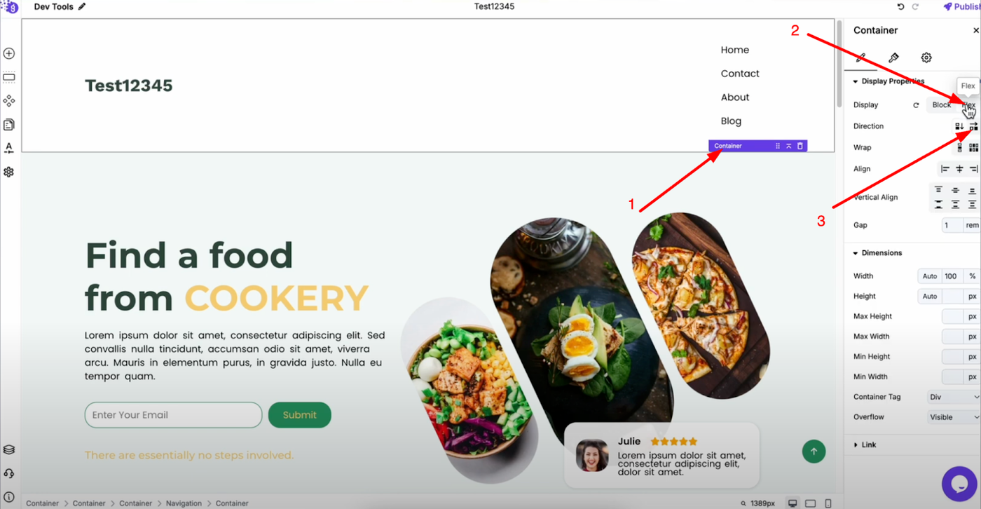
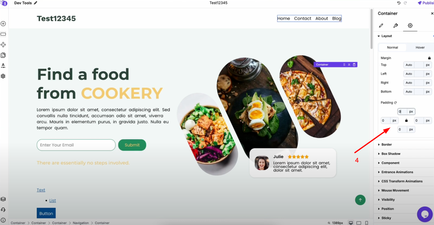
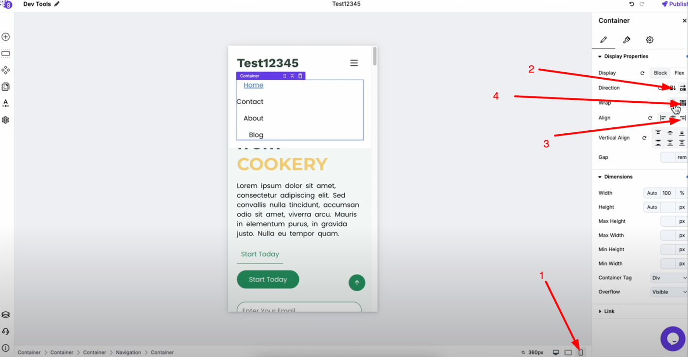
By default, menu items stack vertically. To create a proper horizontal menu, select the container and change its display to flex in the settings. Set the direction to "row" to convert your menu items into a horizontal layout. If there's unwanted padding around the container, remove it by going to advanced settings and setting padding to zero.
Tablet Optimization
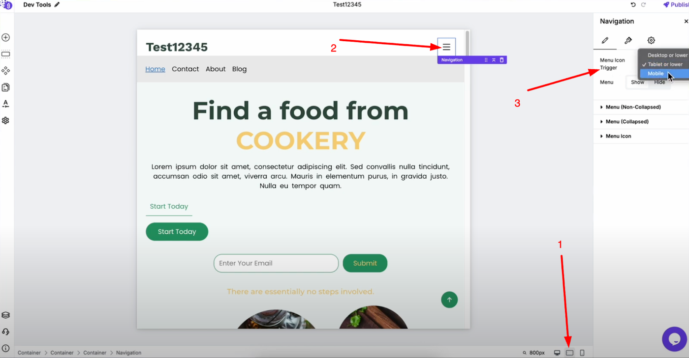
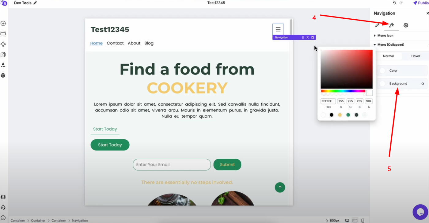
Switch to tablet view and select your navigation block. Choose when the hamburger icon should appear - either "tablet and lower" or "mobile only" depending on your preference. Customize the background color for the collapsed menu (white works well for most designs).
Mobile Optimization
Switch to mobile view and select the container inside your navigation block. Change the flex direction to "column" so menu items stack vertically. Align items to the right and set wrap to "no wrap" for clean mobile navigation that works well with the hamburger menu functionality.