

Want to create clean and interactive menus on your website? This guide will show you how to use the Dropdown Block in Grigora to build stylish, user-friendly navigation menus and sections. Dropdowns help keep your website organized while saving space and improving navigation.
Why Use Dropdown Blocks
Dropdown blocks are essential for creating organized, space-efficient navigation that improves user experience. They allow you to present multiple menu options without cluttering your header or navigation areas, making your website cleaner and more professional while maintaining easy access to all important pages.
Setting Up Your Dropdown Block
Adding to Header Section
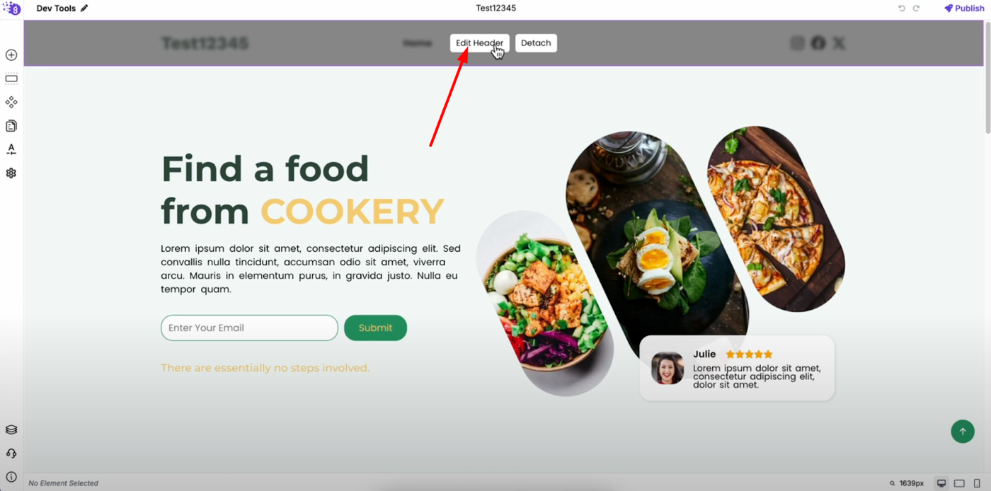
Open Grigora's site editor and navigate to your header area. Click "Edit Header" to open the header section where you'll add your dropdown navigation.
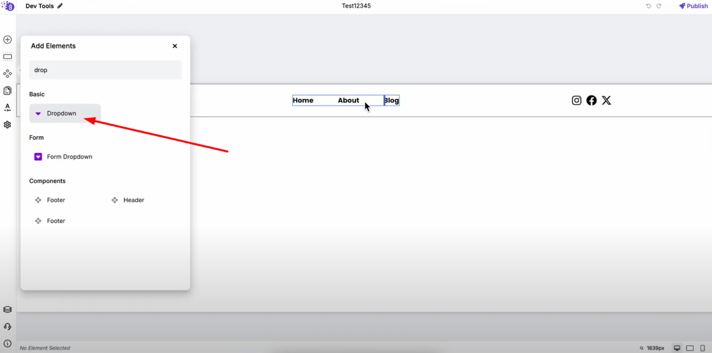
From "Add Elements," add the dropdown block by dragging it into your header layout where you want the dropdown menu to appear.
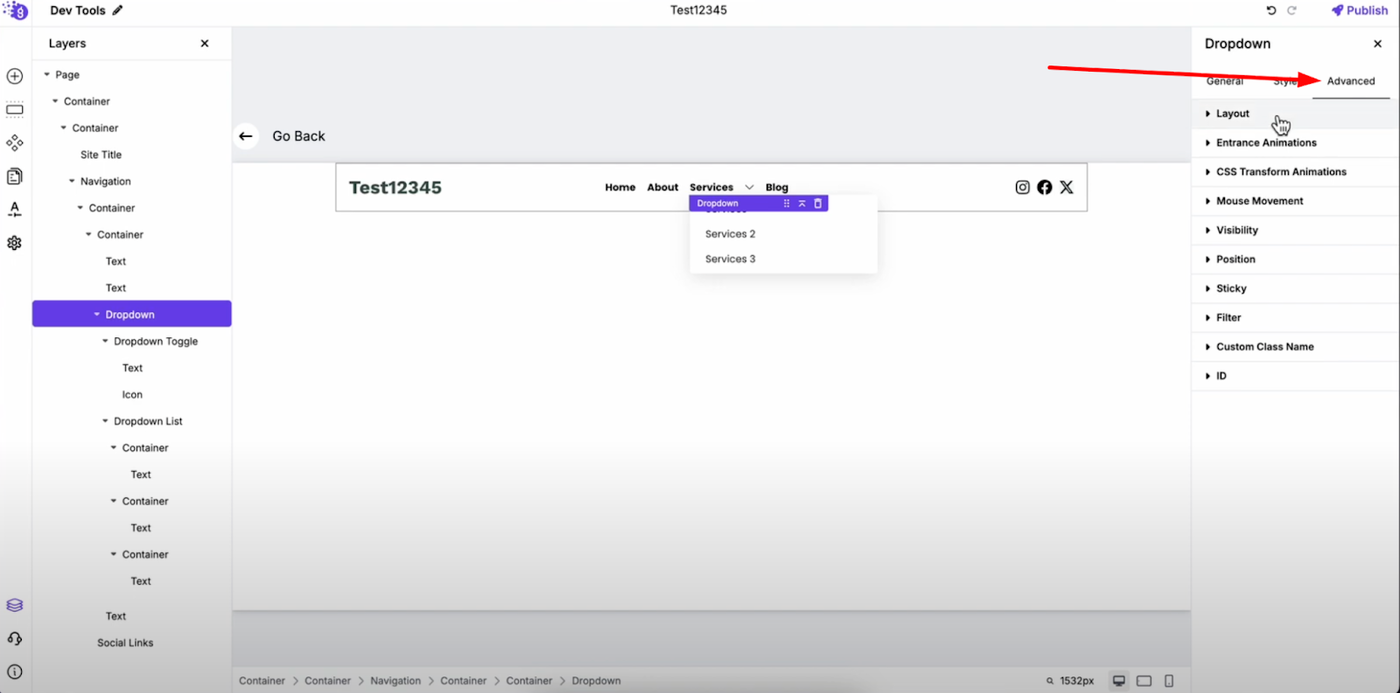
Initial Configuration
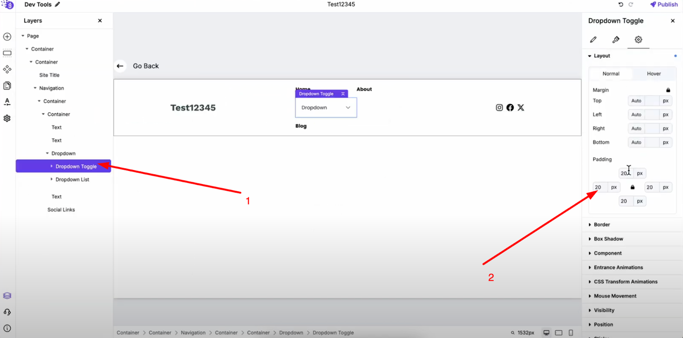
Open the dropdown block's settings to begin customization. Set the padding of the dropdown toggle to zero for clean integration with your header design and optimal spacing control.
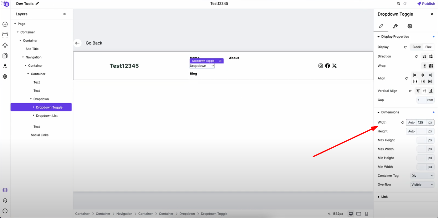
In general settings, define the width of the dropdown toggle to ensure it fits properly within your navigation layout.
Customizing the Dropdown Toggle
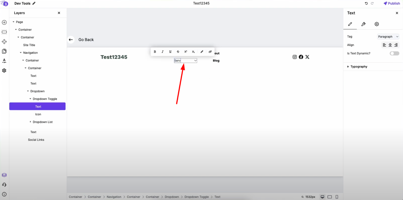
Change the dropdown toggle text to match your navigation needs - this could be "Menu," "Services," "Products," or any category that represents your dropdown content.
Adjust the dropdown toggle's width as needed to maintain visual balance with other navigation elements. Now the dropdown toggle is added to the layout and ready for content customization.
Building the Dropdown Content
Adding Elements to the List
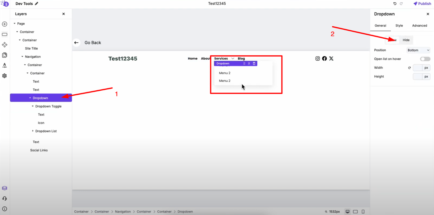
Next, customize the dropdown list by adding elements to it that will appear when users interact with the dropdown. Click on the dropdown to open it, then in its settings, choose "Show" to display the list for editing purposes.
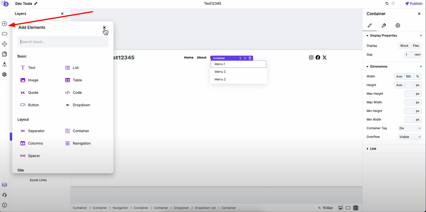
You can add more elements by dragging and dropping from "Add Elements" - this includes text links, buttons, images, or any other content blocks that enhance your dropdown menu functionality.
Configuring Dropdown Behavior
Visibility Controls
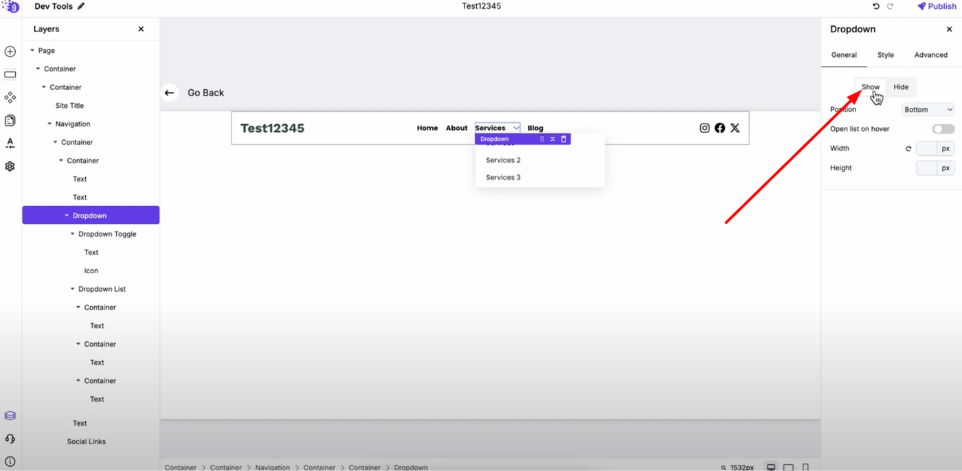
In the dropdown settings, show and hide options control the visibility of the dropdown list, allowing you to test different states and ensure proper functionality across different user interactions.
Position Settings
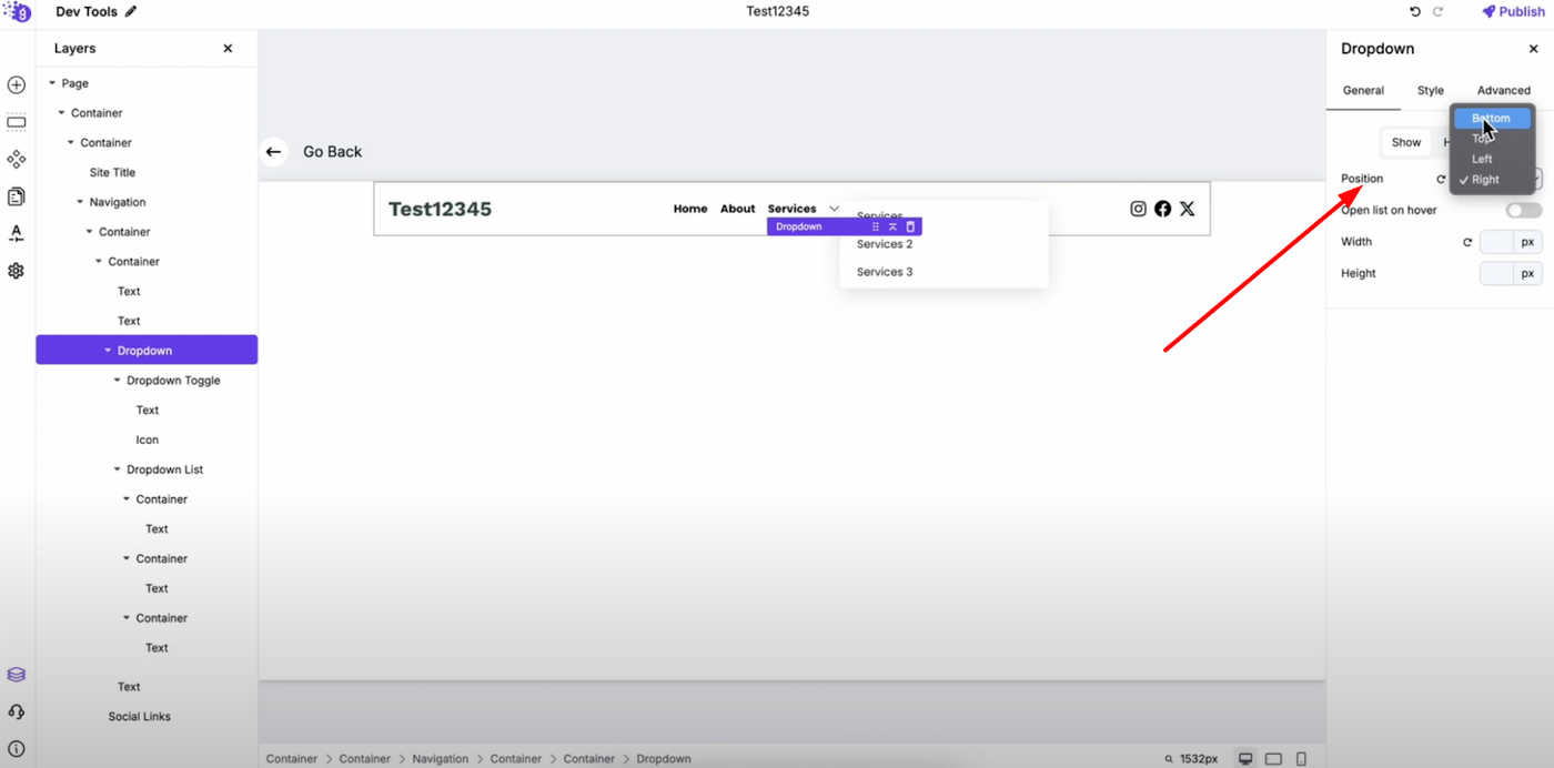
Position setting allows you to choose top, left, right, or bottom for the dropdown list placement. This flexibility ensures your dropdown appears in the optimal location relative to your toggle button and doesn't interfere with other page elements.
Interactive Features
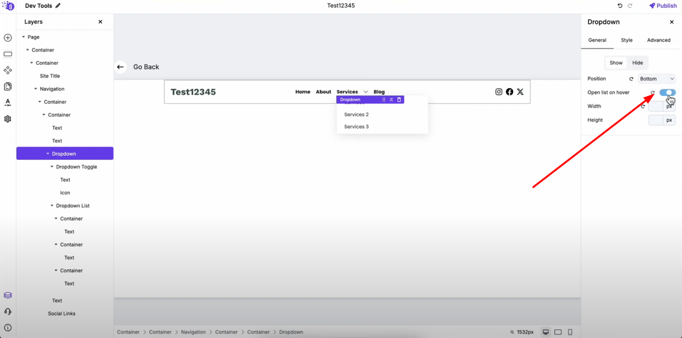
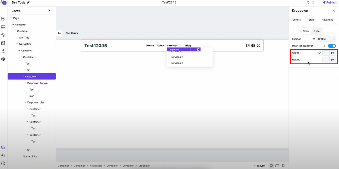
Toggle on "Open on Hover" for more responsive user experience that doesn't require clicking. Adjust width and height to ensure your dropdown content displays properly and maintains readability across different screen sizes.
Visual Customization
Color and Appearance
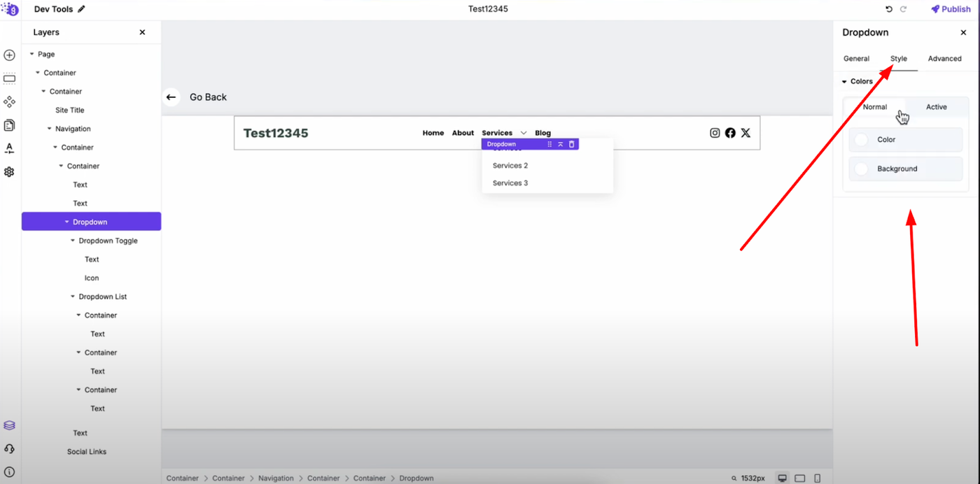
In style settings, change dropdown text color and background color to match your website's brand and design scheme. Customize active color for interactive states that provide visual feedback when users hover or click on dropdown items.
Advanced Styling Options
In advanced settings, further customize the dropdown with additional styling options including borders, shadows, animations, and spacing controls that create professional, polished dropdown menus.
Individual Component Styling
You can also customize toggle and list separately since these blocks have container-like settings. This lets you style the dropdown, toggle, and list individually for maximum design control and brand consistency.
Each component can have its own:
-
Background colors and borders for distinct visual separation
-
Typography settings for different text styling needs
-
Spacing and dimensions for optimal layout control
-
Hover effects and transitions for smooth user interactions
Testing and Implementation
When you preview your website, you'll see the dropdown in the header with the list and your customized layout functioning as designed. Test the dropdown across different devices to ensure consistent behavior and appearance.
Best Practices for Dropdown Menus
User Experience Optimization
-
Keep dropdown content organized and logically grouped
-
Use clear, descriptive labels for dropdown items
-
Ensure adequate spacing between clickable elements
-
Test hover and click interactions across different devices
Design Consistency
-
Match dropdown styling to your overall website design
-
Use consistent colors and fonts throughout the dropdown
-
Maintain proper contrast for accessibility
-
Ensure mobile responsiveness for all screen sizes
Navigation Structure
-
Group related items logically within dropdowns
-
Limit dropdown depth to avoid overwhelming users
-
Use descriptive toggle text that clearly indicates dropdown content
-
Consider loading speed when adding multiple elements
Professional Implementation
This dropdown system provides flexible, professional navigation options that enhance user experience while maintaining clean design aesthetics. Try it out to add interactive dropdown menus to your Grigora site and create more organized, user-friendly navigation that helps visitors find content efficiently.