

Want to make your website truly your own? This guide will break down the features and settings of individual elements in Grigora—text, buttons, images, forms, and more. Learn how to get pixel-perfect results and optimize every block on your site, whether you're a beginner or advanced user.
Understanding Common Element Settings
Most elements in Grigora share common settings like margins, padding, colors, backgrounds, and visibility. This consistent approach makes it easy to master element customization once you understand the core principles that apply across all design components.
Accessing Element Settings
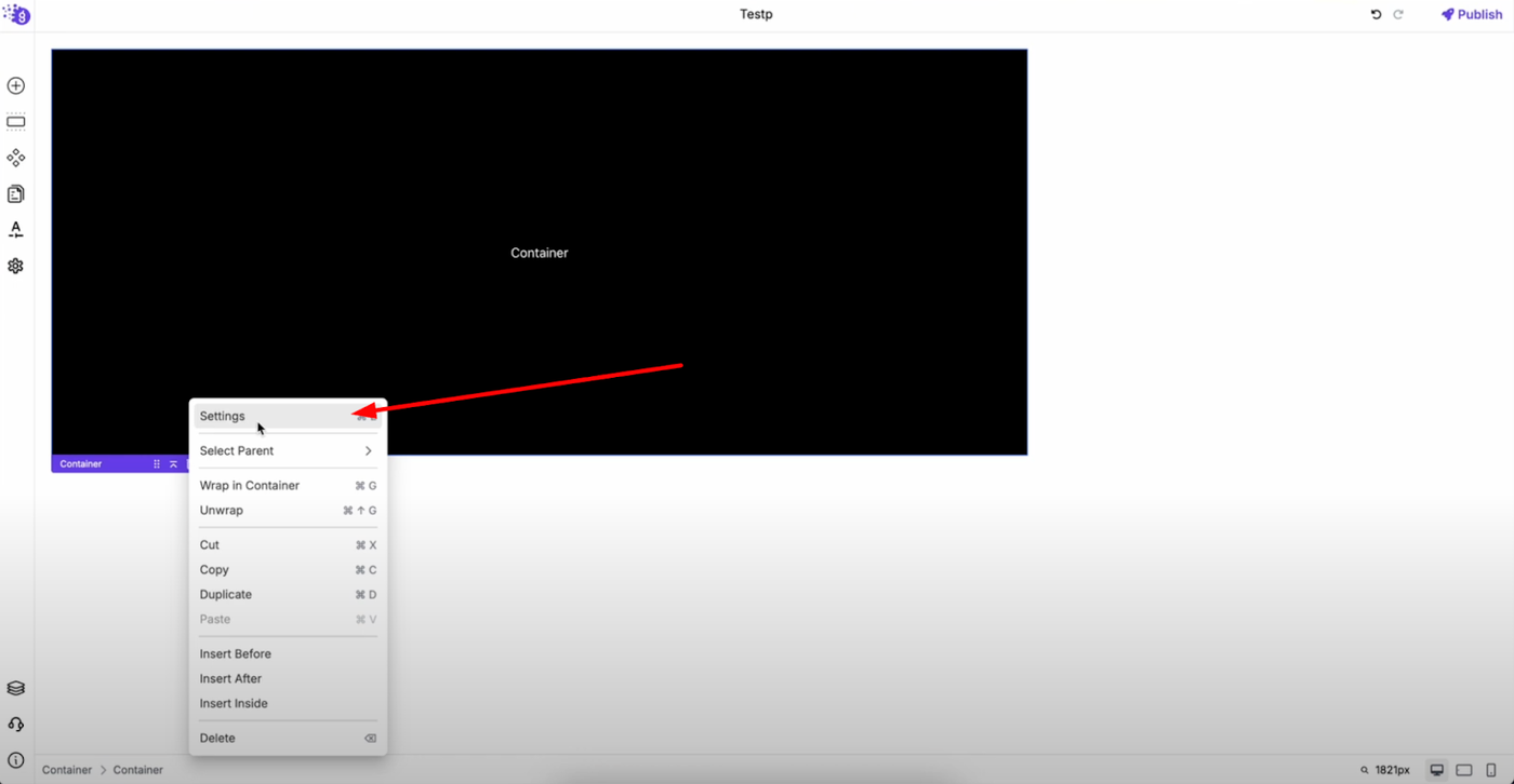
To access element settings, right-click on any element and select "Settings" from the context menu. You can also press Ctrl + E as a shortcut to open the settings panel on the right side of the screen, providing quick access to all customization options.
Margin and Padding Control
Finding Layout Settings
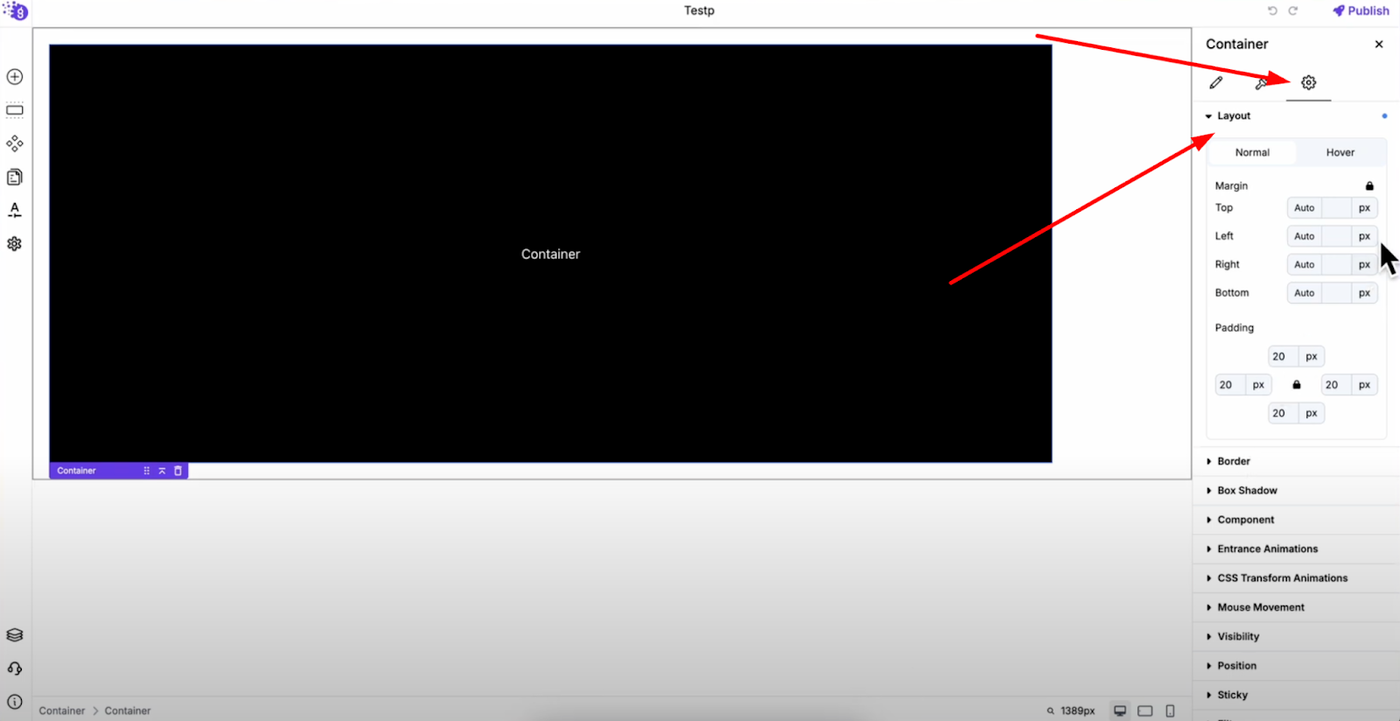
Margin and padding settings are located under the layout section in the advanced settings tab, which is the third tab in the settings panel. These spacing controls are fundamental to creating professional layouts.
Flexible Spacing Options
You can adjust margin and padding individually for top, bottom, left, and right sides, or apply them uniformly to all sides for consistent spacing. You can also set auto margins for responsive spacing that adapts automatically to different screen sizes.
Similarly, padding can be applied per side or to all sides together, giving you complete control over internal element spacing and external element relationships.
Interactive Spacing Effects
Both margin and padding settings can be applied on hover for dynamic user interactions, and you can add transition time for smooth animations that create professional, polished effects when users interact with your elements.
Device-Specific Visibility Control
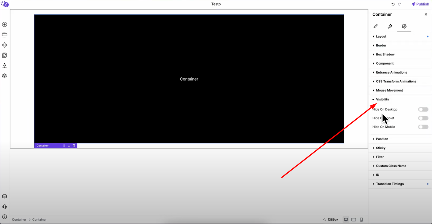
In the same advanced tab, you'll find visibility settings where you can choose to show or hide an element on desktop, tablet, or mobile. This is useful for creating device-specific layouts without affecting your overall design structure.
This responsive control allows you to optimize user experience by showing different content or layouts based on the device being used, ensuring optimal presentation across all screen sizes.
Colors and Background Customization
Accessing Color Settings
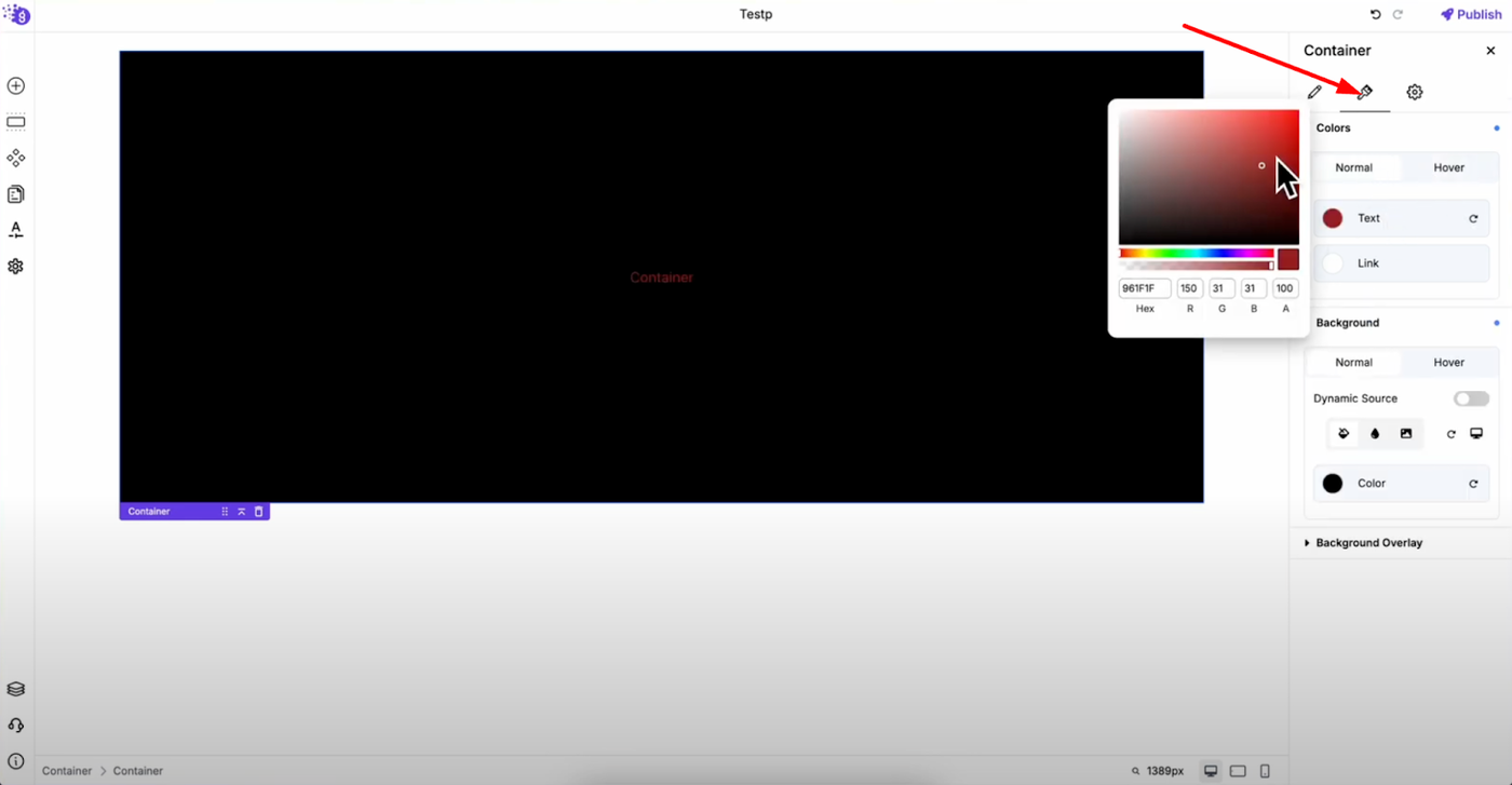
Colors and background options are located in the second tab of the settings panel, providing comprehensive control over your element's visual appearance.
Color Customization Options
You can set normal and hover colors for your element to create both static and interactive color schemes. Simply click the color option, then choose a custom color from the color picker or select from your saved color palette for brand consistency.
Background Styling
The background works the same way and can also have hover effects, giving your elements interactive styling that responds to user behavior. This creates engaging, professional interactions that enhance user experience and visual appeal.
Professional Element Mastery
Understanding these common settings allows you to customize design, spacing, alignment, and behavior of every element on your site. Practice these settings to bring your website design to life by:
-
Creating consistent spacing with margin and padding controls
-
Optimizing for all devices with visibility settings
-
Maintaining brand consistency with color palette integration
-
Adding interactive elements with hover effects and transitions
-
Achieving pixel-perfect results through precise control over every design aspect
Advanced Customization Benefits
This systematic approach to element settings ensures you can tweak every detail without code while maintaining professional standards. Whether you're working with text, buttons, images, forms, or any other element, these core settings provide the foundation for sophisticated, responsive web design.