

Want to keep your header visible while users scroll your site? This guide will show you how to enable sticky headers with just a few clicks in Grigora. Sticky headers improve user experience and boost engagement by keeping menus and CTAs visible as users scroll, and with Grigora, it's incredibly simple to implement.
Accessing Your Header Component
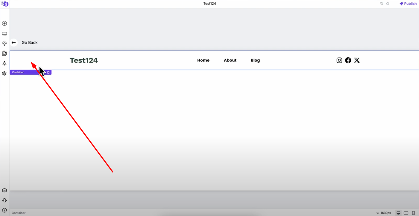
Making a sticky header in Grigora is very simple and straightforward. Go inside your header component and select the main container of your header — this is the outermost container that holds all your header content including navigation, logo, and any other header elements.
Opening Header Settings
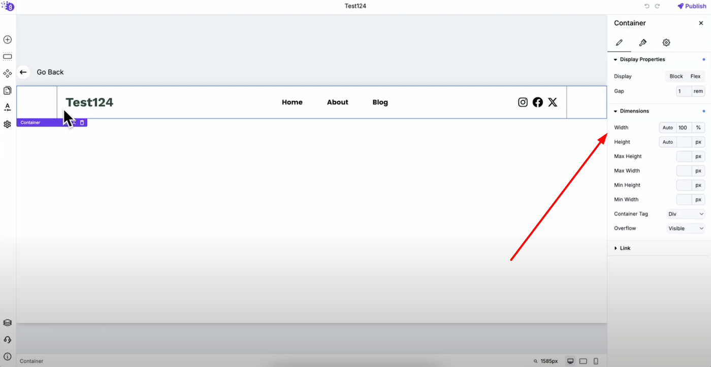
Right-click on the main container and open its settings to access all the customization options available for your header component. This will open the comprehensive settings panel where you can control various aspects of your header's behavior and appearance.
Finding the Sticky Option
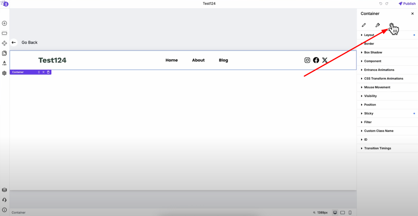
Navigate to the "Advanced Settings" tab, which is the third tab in the settings panel.
Scroll down until you find the "Sticky" option — this is where you can control how your header behaves during user scrolling.
Enabling Sticky Header
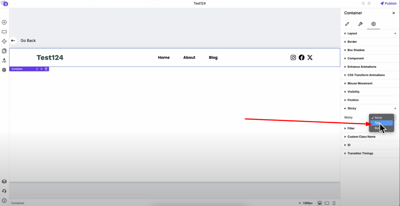
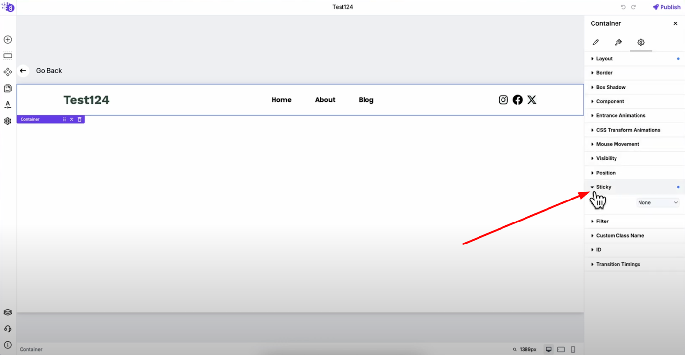
Click on the dropdown menu next to the sticky option and select "Top". Your header is now sticky and will remain at the top of the page when users scroll down through your content, ensuring navigation and important elements stay accessible.
Customizing Device-Specific Behavior
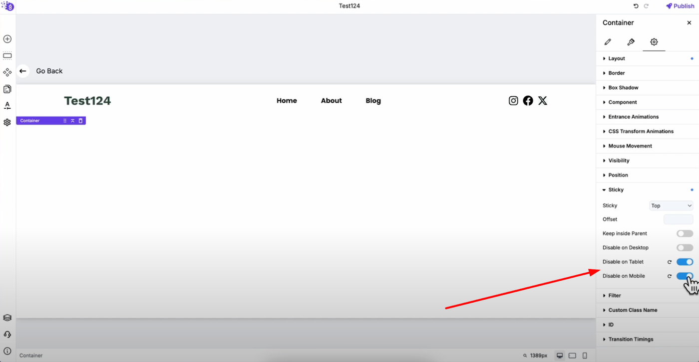
You can customize sticky behavior for different devices to optimize user experience across all screen sizes. For example, you might want to disable the sticky header for tablet and mobile devices while keeping it active for desktop users.
Simply toggle off the sticky option for tablet and mobile in the device-specific controls. This way, the sticky header will only work on desktop, providing a better user experience on smaller screens where screen space is more limited and sticky headers might interfere with content visibility.
Flexible Device Configuration
You can also choose to keep it enabled for desktop and tablet while disabling it only for mobile, or create any combination that works best for your website's specific needs and user behavior patterns.
These device-specific options are designed to improve user experience across different screen sizes by allowing you to tailor the sticky behavior to what works best for each device type.
Benefits of Sticky Headers
Sticky headers provide several key advantages:
-
Make your site easier to navigate by keeping menus always accessible
-
Keep CTAs visible as users scroll, potentially increasing conversions
-
Improve overall user experience by reducing the need to scroll back to the top for navigation