
Notice: Manual Directory Loops are Not Available in the New AI Editor
This guide applies specifically to the legacy drag-and-drop editor. If you are building your website using the new AI editor, manually adding Directory Listing blocks, configuring directory loops, and setting up conditional filters is not available or needed. The AI automatically creates, organizes, and styles all directory listings, search views, and card grids based on your chat prompts.
Learn how to display directory data on your website using Grigora's Directory Block. This guide will show you how to select your collection, loop through items, and customize how your directory appears on the page for creating visually appealing directories that automatically update as your collection grows.
Setting Up Your Directory Display
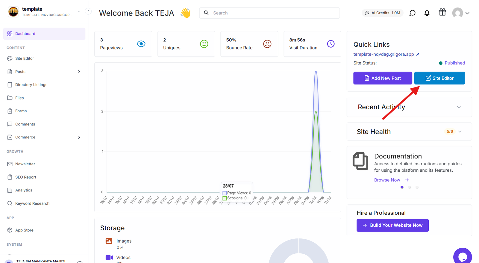
Go to your Grigora dashboard and click on "Site Editor" to open the website editing interface. You can choose where to display your directory - create a separate page for directory listings or add to your homepage for prominent display.
Adding the Directory Block
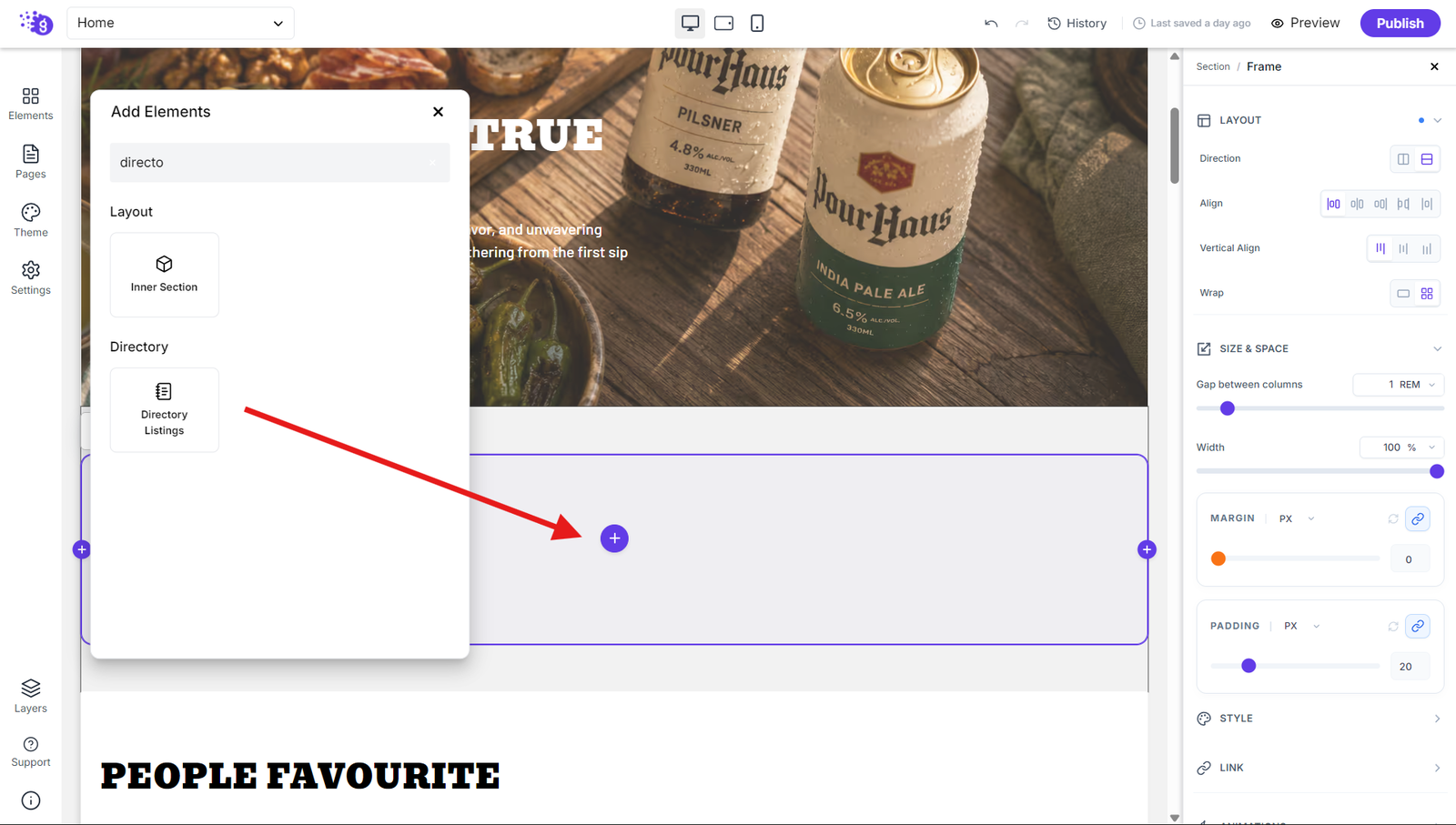
Click "Add Elements" in the left panel and search for "Directory Listing" in the search bar. Drag and drop the directory block into your editor where you want it to display.
Configuring Directory Settings
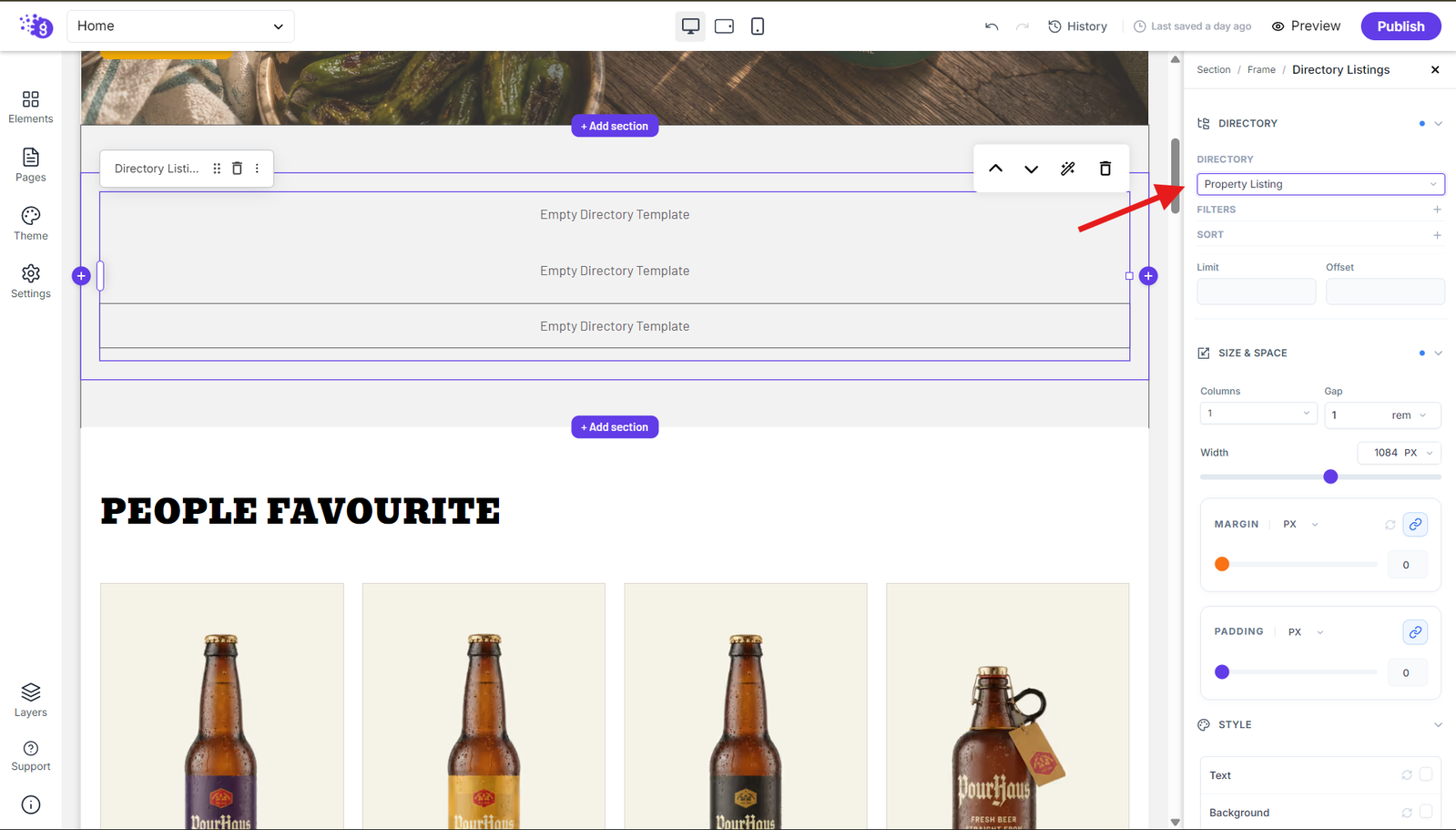
Right-click on the directory block to open settings and configuration options. Select your collection from the dropdown menu (like "Property Listing" or whichever collection you created). The block will now be connected to your chosen directory collection.
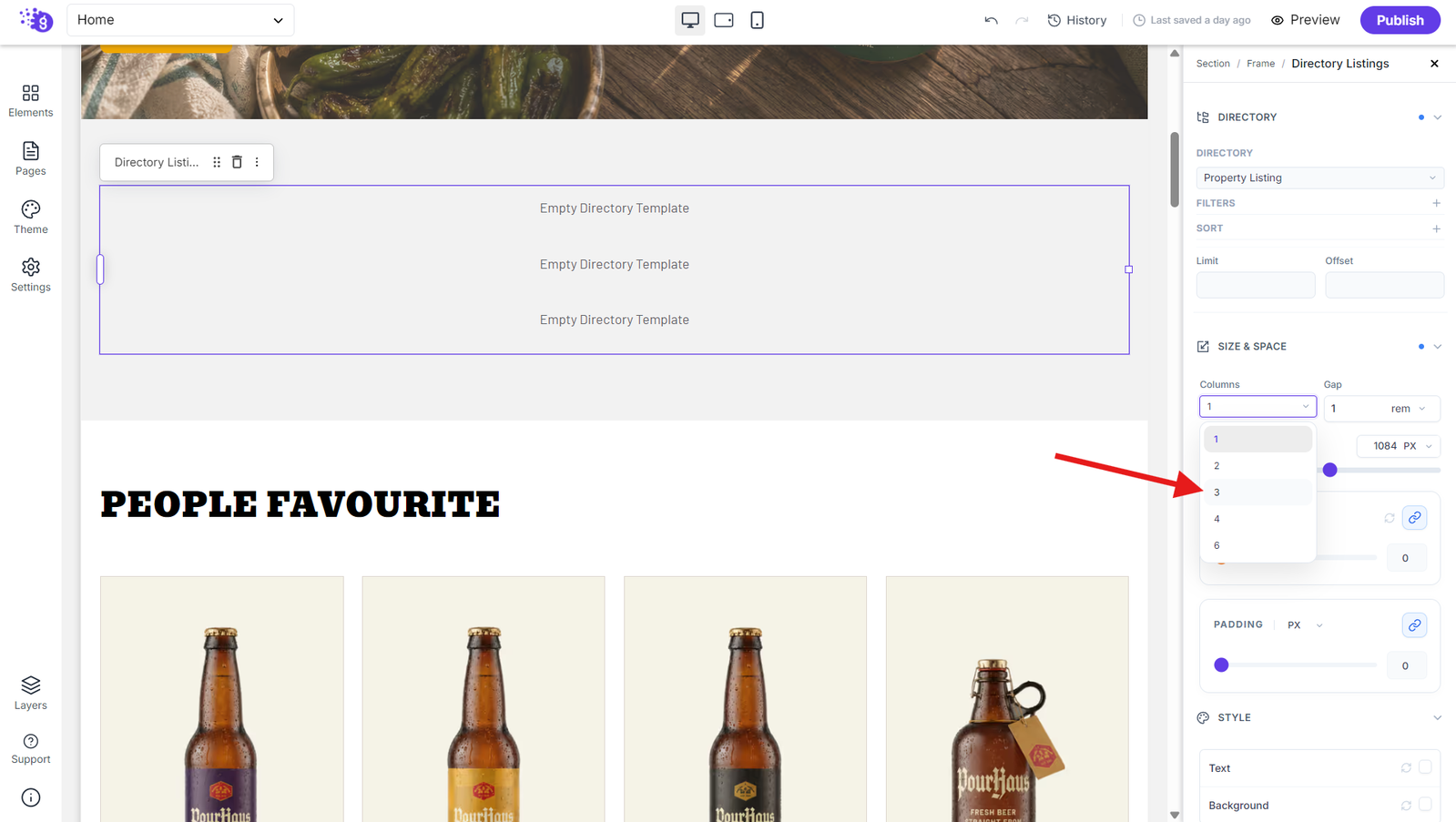
Click on dimension settings and set columns to three (or your preferred number) to create a grid layout where your directory items will display in organized rows and columns.
Configuring Pagination
Enable the Enable Pagination toggle in the Directory block settings to display pagination controls for your directory items. Once enabled, the pagination numbers are automatically generated based on the configured limit and offset values and the number of available directory items.
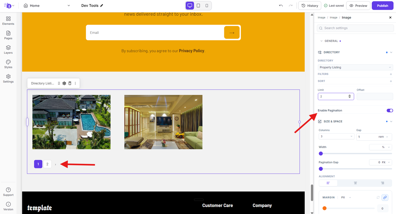
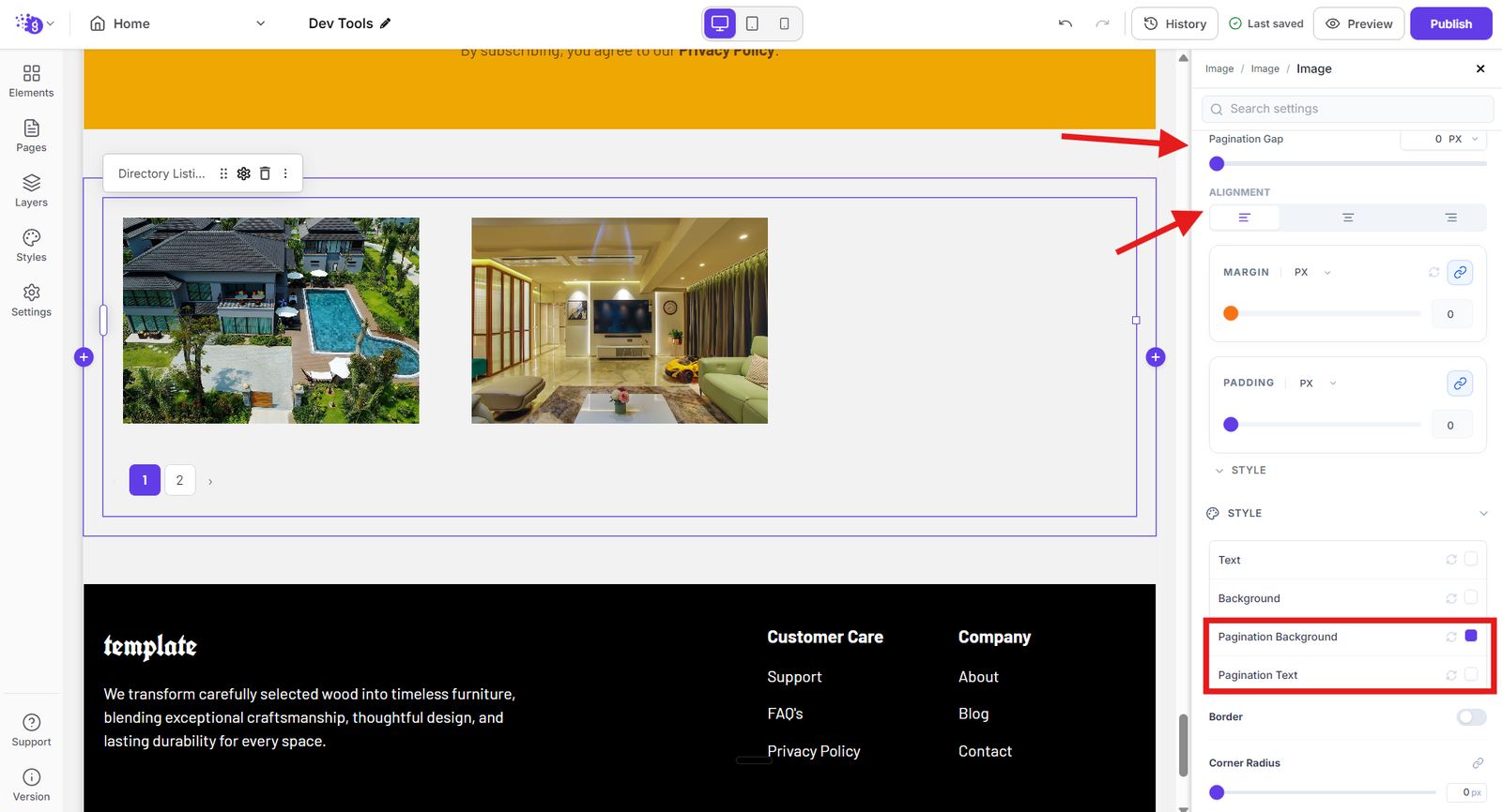
Under the Size & Space settings, you can control the pagination gap and alignment. The Pagination Gap option lets you adjust the vertical space between the Directory listings and the pagination controls, while the Alignment options allow you to position the pagination controls to the left, center, or right. The Style settings also let you customize the appearance of the pagination by changing the pagination background and pagination text colors, allowing you to match the pagination controls with your website’s overall design.
Creating Directory Item Layout
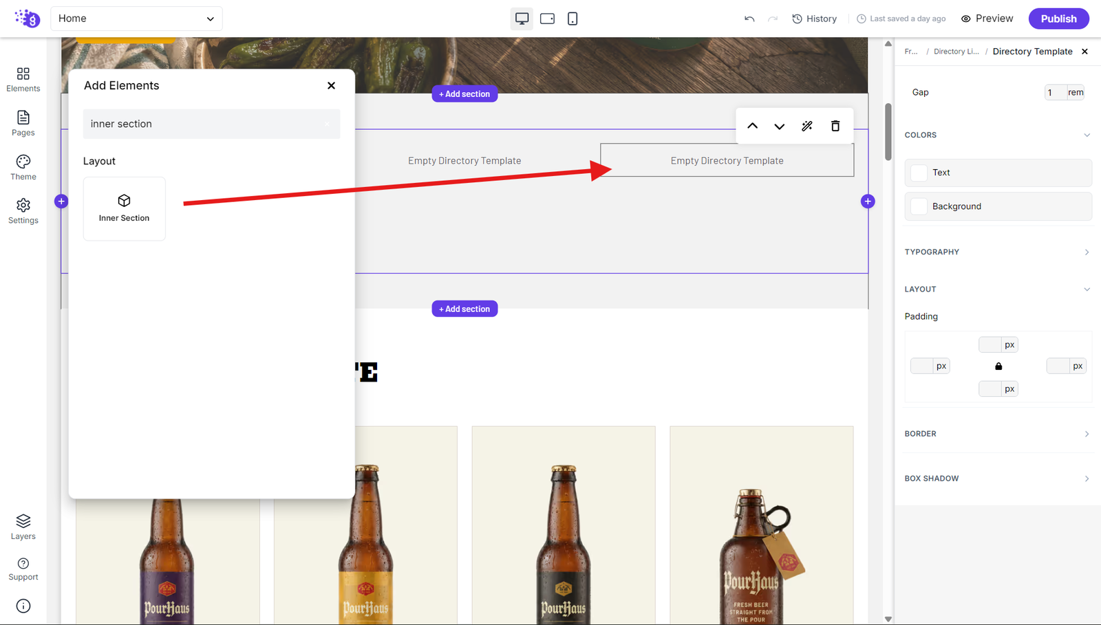
Click "Elements" and search for "Inner section" to drag the container into your directory block. This Inner section will hold the layout for each individual directory item.
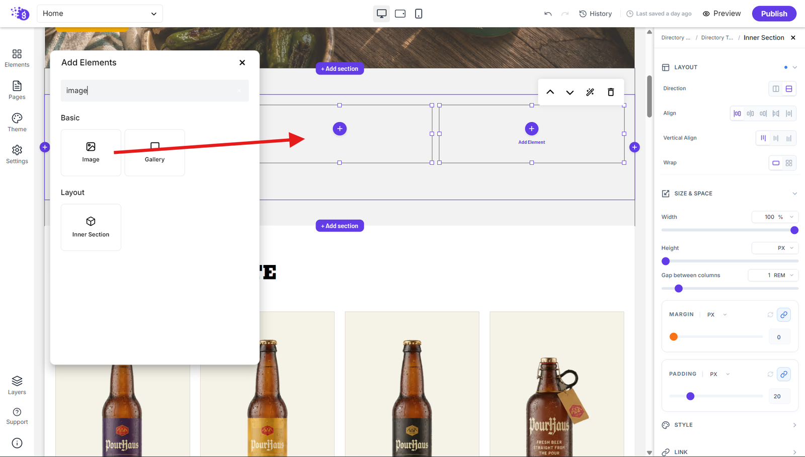
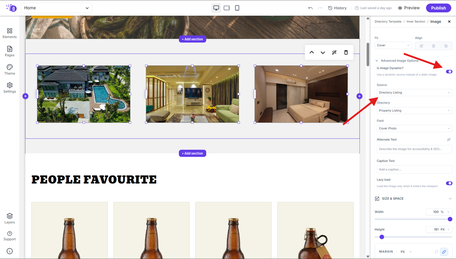
Add an image block into your container and enable dynamic source. The system will automatically detect your directory collection and link the image dynamically to display different images for each item.
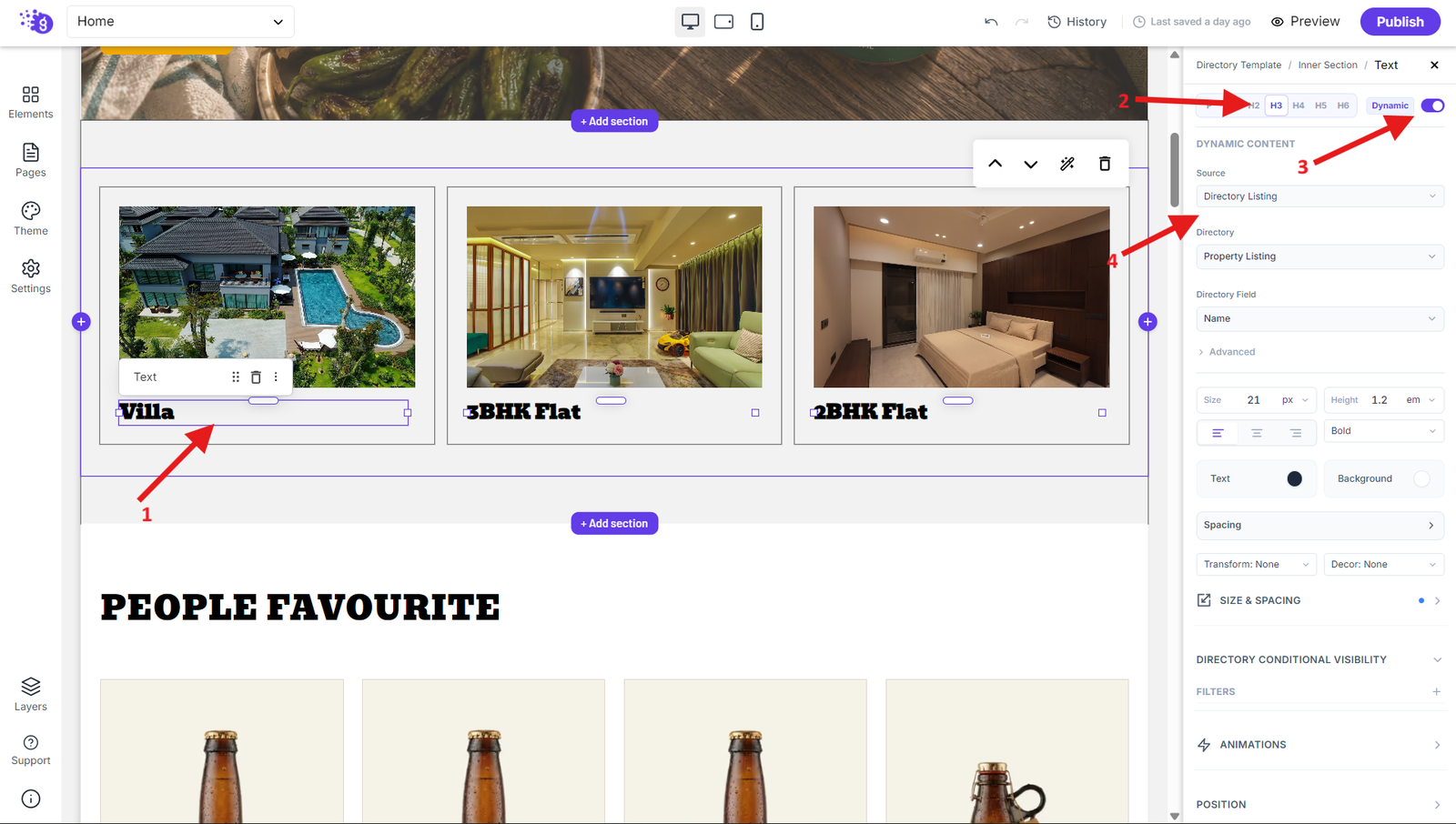
Add a text block and enable dynamic source. Select your directory collection from the source dropdown and choose the name field from directory field options. Style the text by changing it to H3 heading and adjusting font size.
Adding Additional Information
Add another text block for additional information like price, description, or other fields. Enable dynamic source and select the specific field you want to display to make your directory items more informative and visually appealing.
Styling and Making Items Clickable
Select the Inner Section holding your directory item elements and add borders to create a card-like appearance. Change border colors to match your brand and adjust spacing and padding for better visual hierarchy.
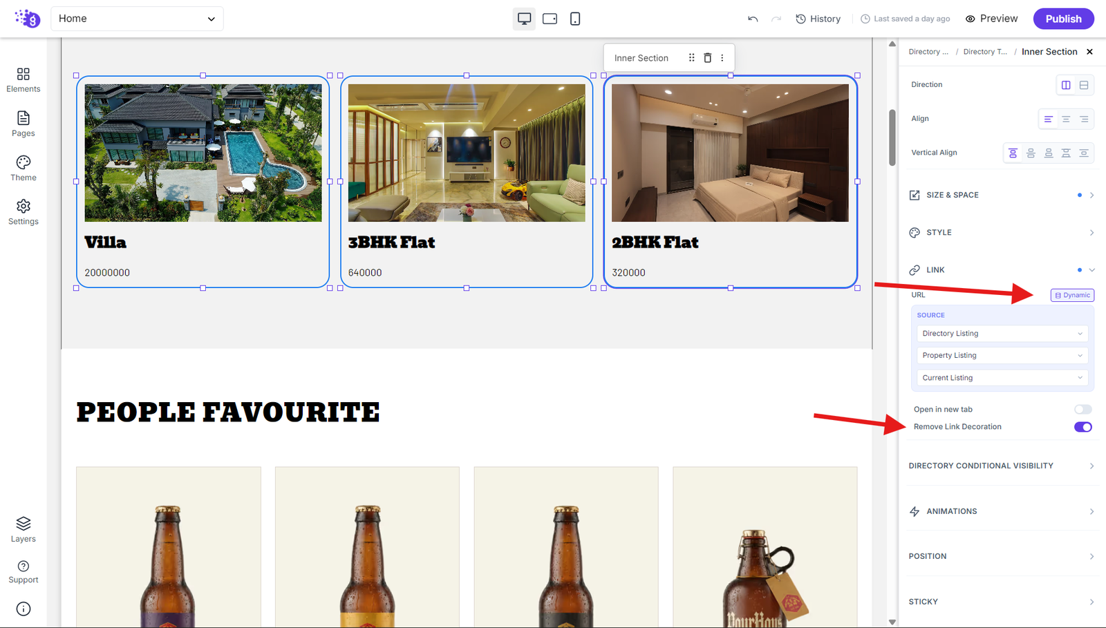
To make directory items clickable, select your Inner Section block, navigate to the links section, and toggle the dynamic source. Select your source directory and link field so each item card becomes clickable and takes users to a dedicated detail page.
Configure Directory Conditional Filters
Directory Conditional Filters allow you to control which items are displayed in a Directory Lsiting Loop by applying conditions to specific directory fields. You can add multiple filters and define the field, operator, and value to determine which items should be included in the loop.
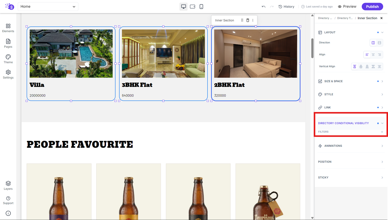
Add a Filter
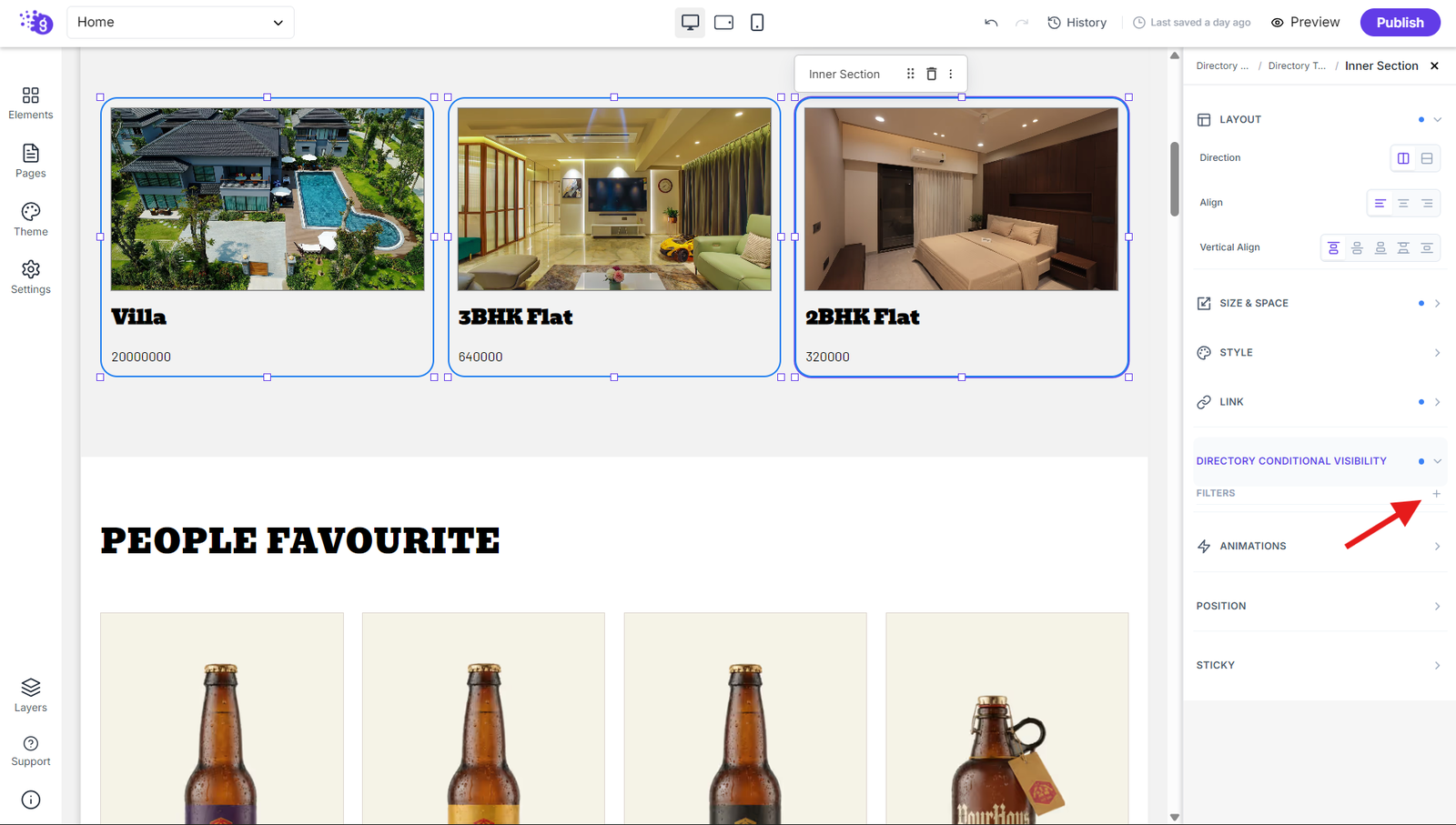
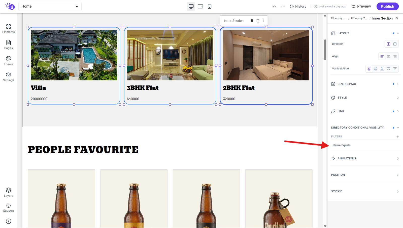
Click the + icon next to Filters to add a new conditional filter. A filter will be added to the list, which you can configure based on your requirements.
Edit a Filter
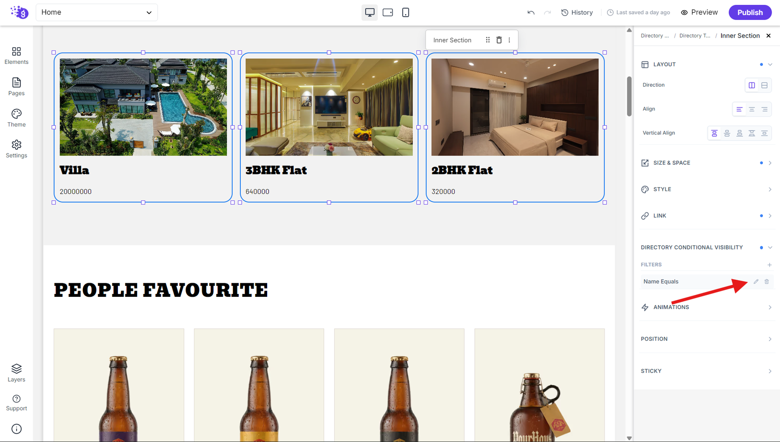
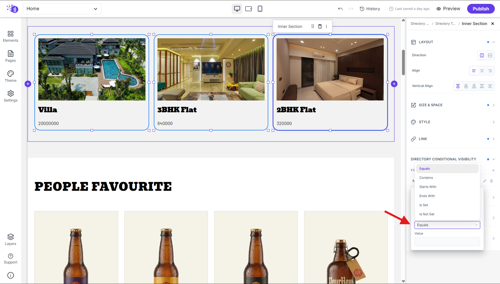
After adding a filter, click the pencil icon to modify it. In the Edit Filter panel, select the Field, choose an Operator, and enter the Value that should be used for filtering.
Available Filter Conditions
Equals: Displays items where the selected field exactly matches the specified value.
Contains: Displays items where the selected field contains the specified value anywhere in its content.
Starts With: Displays items where the selected field begins with the specified value.
Ends With: Displays items where the selected field ends with the specified value.
Is Set: Displays items where the selected field has a value or is not empty.
Is Not Set: Displays items where the selected field has no value or is empty.
Preview the Applied Filters
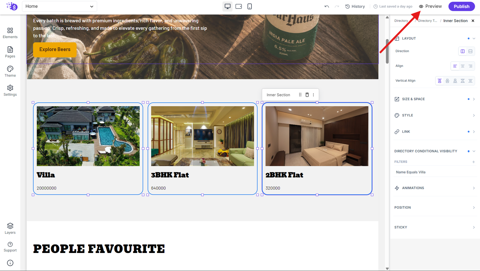
Before deleting a filter, click the Preview button next to Publish in the editor. The preview will show the CMS Loop with the configured filters applied, allowing you to verify that only the matching directory items are displayed.
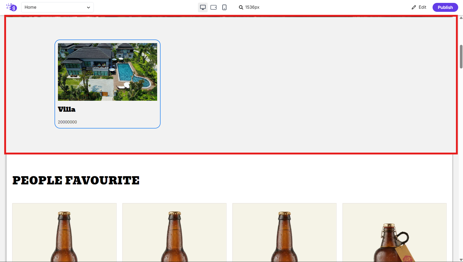
Delete a Filter
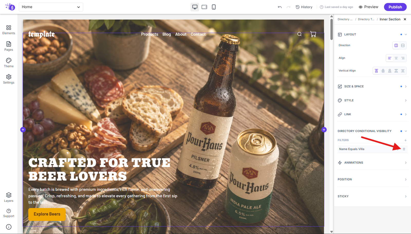
If a filter is no longer required, click the trash icon next to the filter to remove it.
Publishing Your Directory

Click "Save and Publish" to make your directory live on your website. Your directory will display dynamic content that automatically updates as you add or modify items in your collection, providing visitors with an organized, professional way to browse and discover your directory content.