

Grigora's new AI editor combines conversational site generation with an interactive live canvas. This walkthrough provides an overview of every button, toolbar control, and tool available on your screen so you can navigate the editor with confidence.
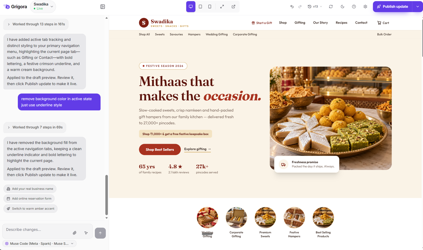
1. Top Navigation Bar Controls
The top navigation bar contains project-level actions, viewport controls, and publishing options arranged from left to right:
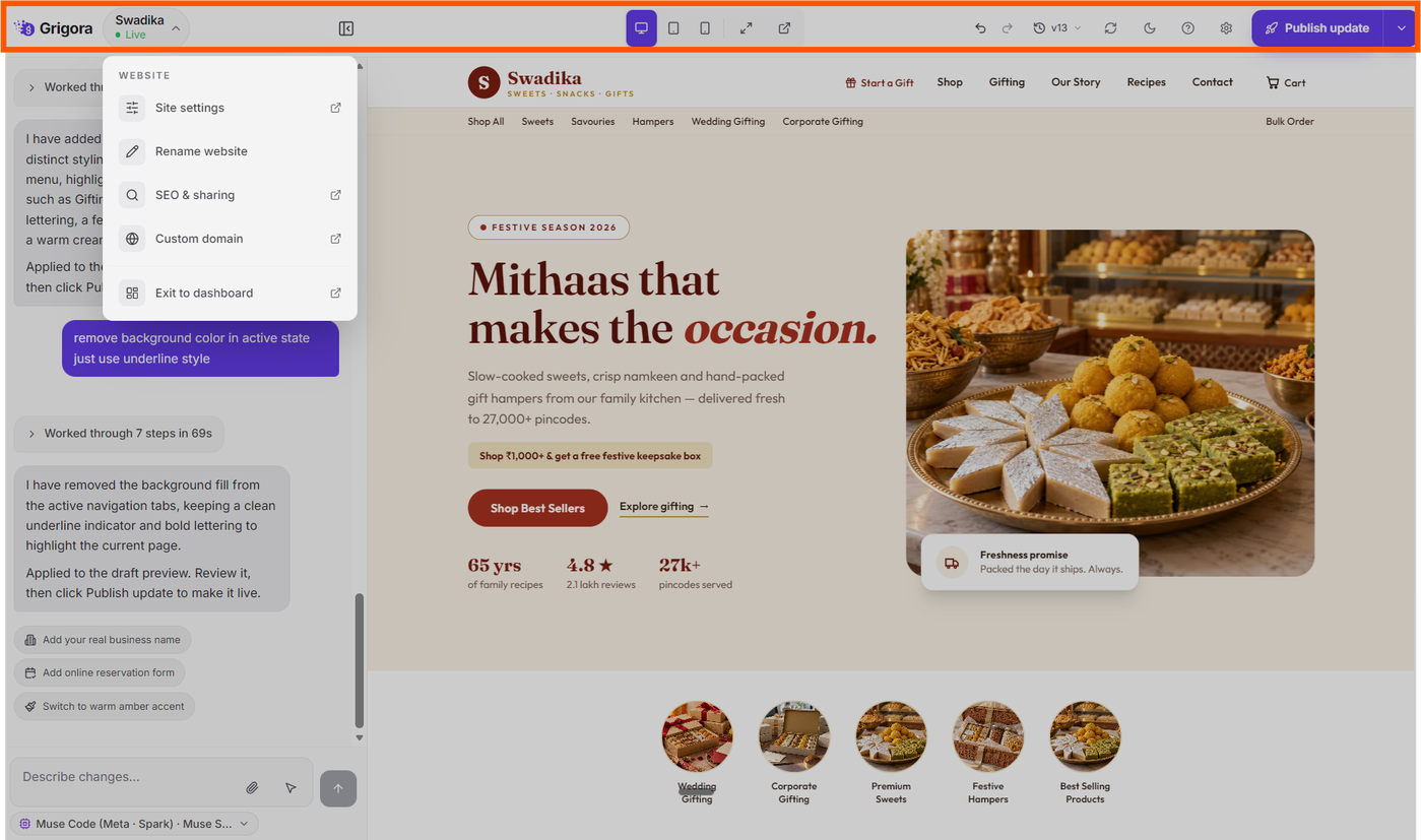
Website Name & Status Pill: Located on the far left. Displays your website name along with a status dot (gray for Draft, green for Live). Clicking this pill opens the website menu with quick shortcuts to Site settings, Rename website, SEO & sharing, Custom domain, and Exit to dashboard.
Chat Panel Toggle Button: Positioned next to the website name pill. Clicking this button collapses or expands the AI Chat panel on the left, allowing you to give full focus to the website preview canvas.
Responsive Viewport Switcher: Located in the center of the topbar. Features three device icons—Desktop, Tablet, and Phone. Clicking any icon resizes the preview canvas to match that device's screen dimensions.
Fullscreen Editor Button: Located next to the viewport controls. Clicking the expand icon expands the website preview across your entire monitor for distraction-free reviewing.
Open in New Tab Button: Positioned beside the fullscreen button. Opens your website preview in a separate browser tab so you can test navigation and layout in a standard browser window.
Undo & Redo Buttons: Located on the right side of the toolbar. The left arrow reverts your latest prompt adjustment, while the right arrow reapplies it.
Version History Button: Displays your current version label (e.g., v1, v2). Clicking it opens the version history dropdown showing all saved iterations and snapshot dates. (For complete details, see our dedicated guide on managing versions).
Refresh Preview Button: The circular arrow button reloads the preview canvas frame to ensure the latest styling and content changes are rendered.
Theme Toggle Button: The sun/moon icon switches the editor interface between light and dark themes.
Help & Support Menu: The question mark icon opens direct links to the Help Center, Support chat, and Bug reporting.
Quick Settings Gear: The gear icon opens a flyout modal where you can quickly rename your website or connect a custom domain.
Publish Button & Menu: The primary purple button (rocket icon). Clicking it deploys your website live to your web address. Once published, a dropdown arrow appears next to the button offering the option to unpublish or take your website offline.
2. Left AI Chat Panel Controls
The left panel is your conversational command center for instructing the AI assistant, reviewing build progress, and requesting modifications:
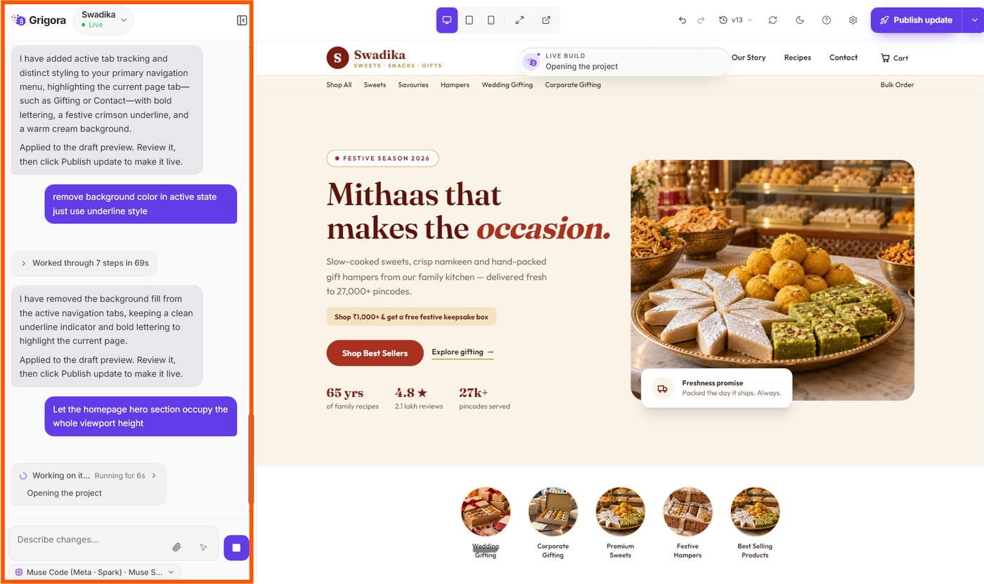
Activity Status Stream: Displays live progress messages during generation, outlining the steps the AI takes to design sections, write text, and apply styles.
Prompt Input Area: The multi-line text box at the bottom of the panel where you type instructions, style requests, content updates, or new page additions.
Attach Files (+ / Paperclip Button): Allows you to upload brand assets, logos, photographs, PDF documents, or CSV spreadsheets for the AI to include in your site design.
Point at the Site Button (Cursor Icon): Clicking this tool provides two targeted visual options:
Select an element to edit: Turns your cursor into an inspector. Click any button, card, or headline on the preview canvas to pin that exact element to your chat prompt for precise editing.
Annotate the page: Activates the visual annotation tool so you can highlight areas of the canvas directly.
Stop Generation Button: While the AI is actively building or writing, the send button turns into a square icon. Clicking it immediately stops generation.
Send Button (Arrow Up): Submits your prompt to the AI to initiate updates.
Follow-Up Suggestion Chips: Contextual pill buttons that appear below AI responses offering quick one-click enhancement ideas (such as adjusting colors, expanding copy, or adding sections).
3. Right Live Preview Canvas
The canvas displays your website in real time as the AI generates it:
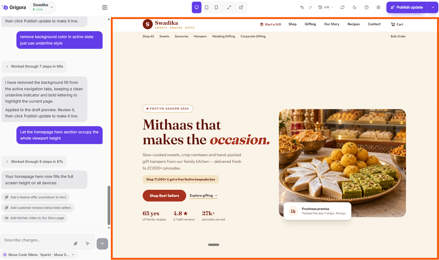
Interactive Testing: You can click links, buttons, and navigation menus directly within the canvas to test functionality.
Visual Element Highlighting: When element selection mode is active, hovering over blocks outlines them, allowing you to select specific components with a single click.
Multi-Page Navigation: Clicking internal links transitions between your generated pages (such as Home, About, or Contact).
Next Steps
Now that you are familiar with the editor interface, explore our in-depth guides to master core workflows:
How to Select Elements and Annotate Pages in the AI Editor — Learn how to highlight elements for targeted edits and draw visual markups directly on the canvas.
Publishing Your Website for the First Time: Launch Sequence & Live Setup — Understand the real-time launch progress and configure search appearance and custom domains.
How to Manage Website Versions in Grigora — Learn how version snapshots work, how to preview previous iterations, and how to restore older versions.
How to Preview and Review Your Built Website in Grigora — Explore all the ways to inspect responsiveness, test interactive elements, and preview your site in standalone browser windows.
How to Create a Website Using the AI Website Editor — Step-by-step instructions for creating a brand-new website from your first prompt.