

In this comprehensive guide, we'll take a deep dive into the Inner Section Block inside Grigora. Mastering the Inner Section Block will help you create organized, flexible layouts within your sections by grouping content, controlling alignment and spacing, and customizing the appearance and behavior of nested content.
General Settings Configuration
Layout Control
The Inner Section Block provides flexible layout controls that help you arrange and align the content placed inside it.
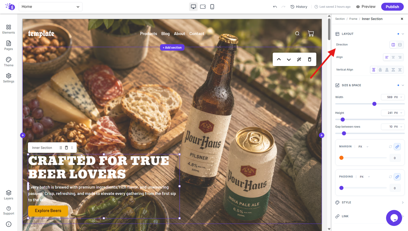
Direction
Choose how the content inside the Inner Section is arranged:
Row: Places inner content horizontally from left to right.
Column: Places inner content vertically from top to bottom.
This gives you control over whether your content should follow a horizontal or vertical layout.
Align
Control the horizontal alignment of the content inside the Inner Section.
You can align content to the:
Left
Center
Right
This makes it easier to position content consistently within the available space.
Vertical Align
Control how content is positioned vertically within the Inner Section.
You can choose from multiple vertical alignment options to position content at the top, center, bottom, or distribute it according to the available space.
Size & Space
The Size & Space settings allow you to control the dimensions and spacing of the Inner Section.
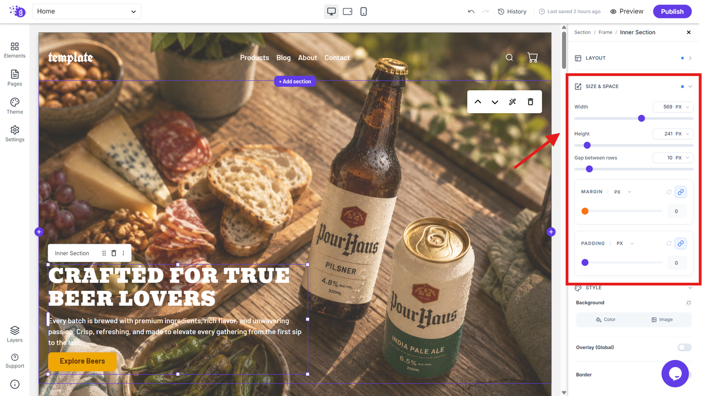
Dimensions Control
Width: Define the width of the Inner Section using a specific value and supported units.
Height: Set a specific height for the Inner Section to control the vertical space it occupies.
Gap Between Rows
Control the amount of spacing between rows of content inside the Inner Section.
This is particularly useful when using a column-based layout and you need consistent spacing between multiple elements.
Margin and Padding
Control the spacing around and inside the Inner Section for precise layout adjustments.
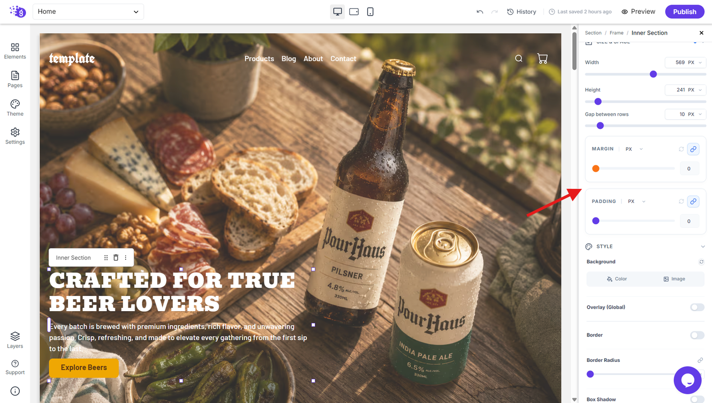
Margin
Add external spacing around the Inner Section. You can link the values to apply the same spacing to all sides or unlink them to control each side independently.
Padding
Add internal spacing between the Inner Section's boundary and its content. Padding values can also be linked or unlinked for precise control over individual sides.
Style Settings
The Style settings allow you to customize the visual appearance of the Inner Section.
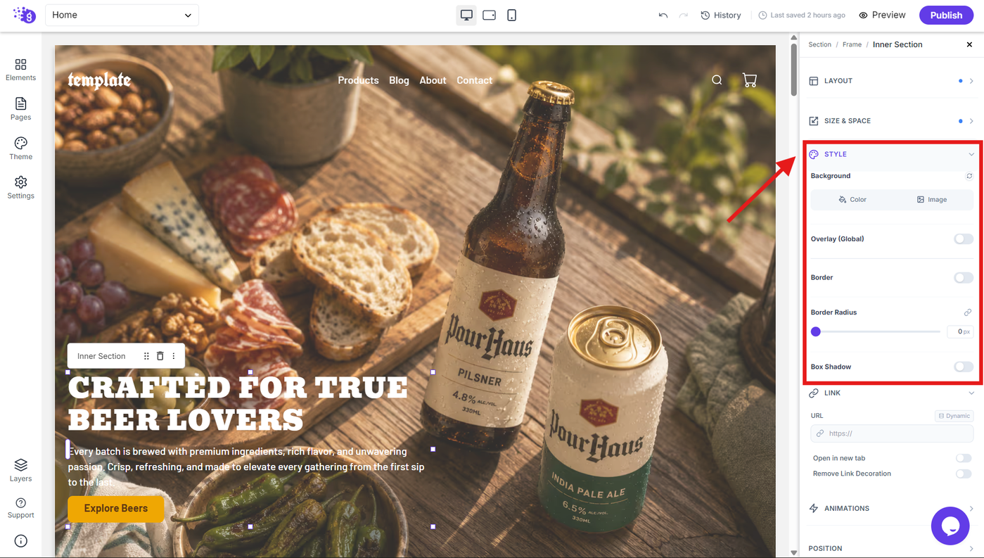
Background Options
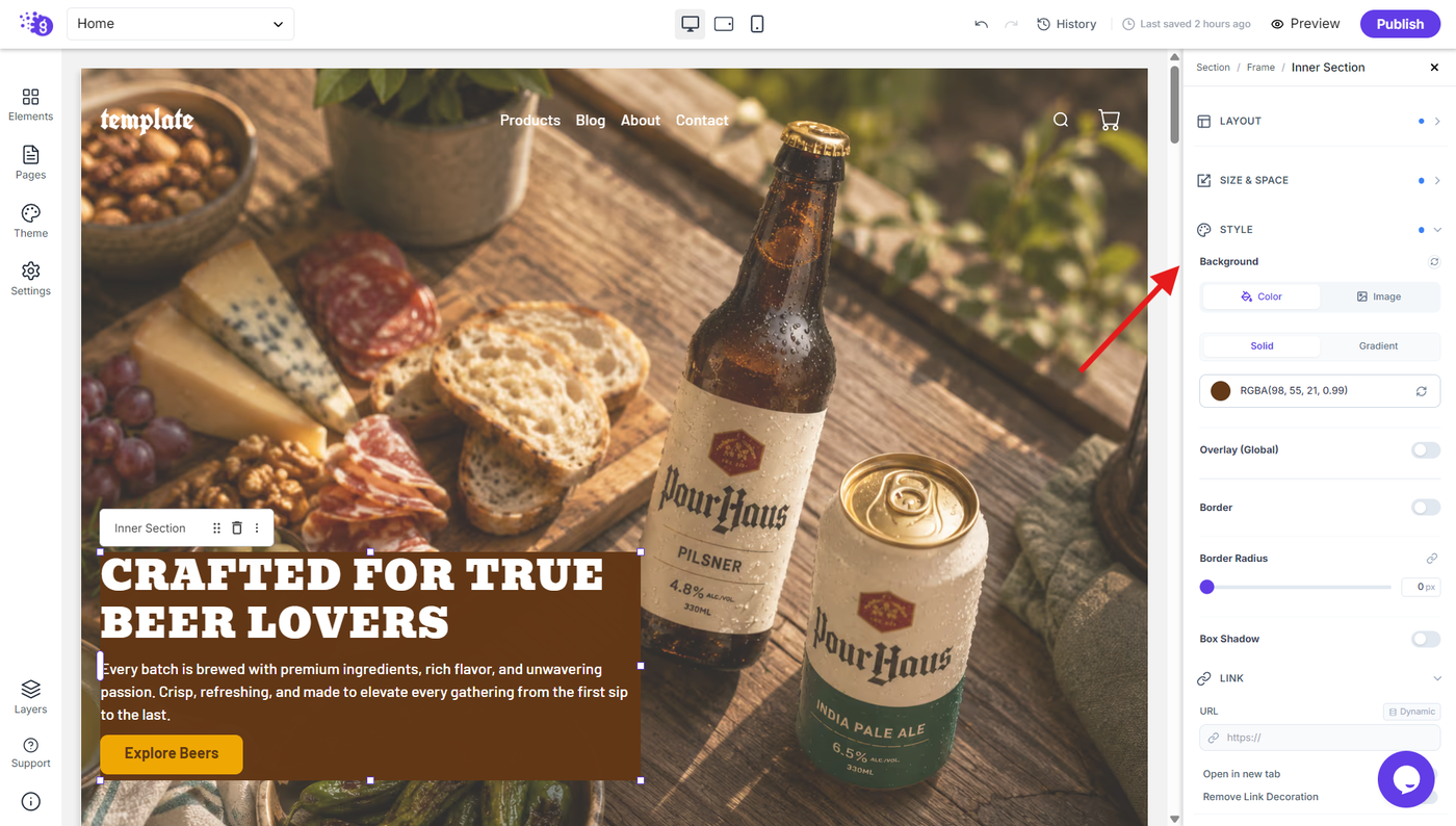
Customize the visual background of your Inner Section using different background options.
Color
Apply a solid background color to the Inner Section for clean and simple designs.
Image
Use an image as the background of the Inner Section to create visually rich layouts.
Background Overlay
Apply a global overlay to the Inner Section background to enhance contrast and improve the appearance of background content.
Border and Visual Styling
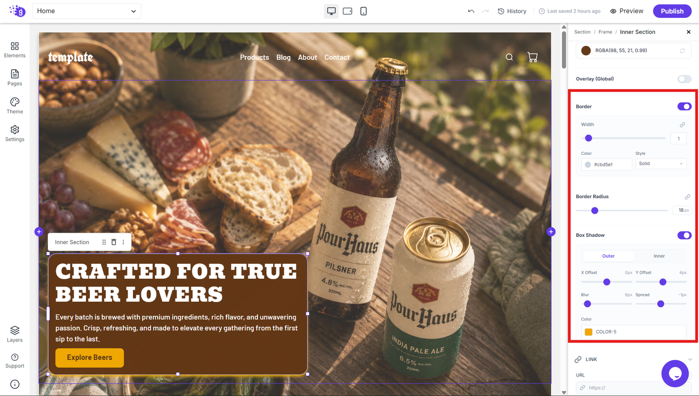
Border
Enable borders around the Inner Section to visually separate it from surrounding content.
Border Radius
Adjust the border radius to create rounded corners on the Inner Section. You can use the slider or enter a specific pixel value for precise control.
Box Shadow
Add a box shadow to the Inner Section to create depth and separation from the surrounding content.
These effects can be useful for creating cards, panels, highlighted content areas, and other visually distinct sections.
Link Functionality
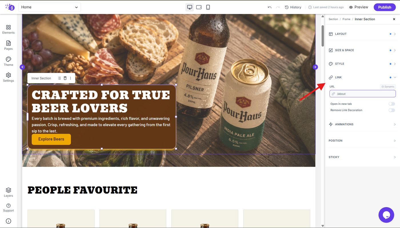
The Inner Section can be converted into a clickable element using the Link settings.
URL
Enter the destination URL for the Inner Section. You can also use the Dynamic option to connect the link to dynamic content.
Open in New Tab
Enable this option to open the linked destination in a new browser tab.
Remove Link Decoration
Remove the default link decoration from the Inner Section when it is used as a link.
This is useful when you want the entire Inner Section to behave as a clickable element without displaying traditional link styling.
Animation and Effects
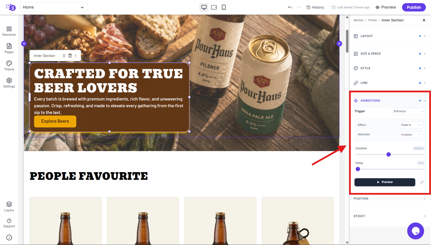
The Animations settings allow you to add dynamic visual effects to the Inner Section and control how it appears or responds to user interactions.
Trigger
Choose when the animation should be activated. Grigora provides the following trigger options:
None: Disable animations for the Inner Section.
Entrance: Apply the animation when the Inner Section enters the page.
On Scroll: Trigger the animation as the Inner Section comes into view while scrolling.
On Hover: Trigger the animation when the visitor hovers over the Inner Section.
Infinite: Continuously repeat the selected animation.
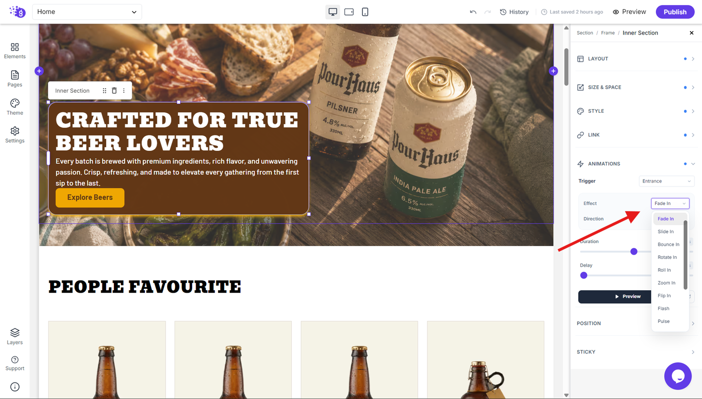
Effect
Choose the visual effect used when the animation is triggered.
Available effects include:
Fade In
Slide In
Bounce In
Rotate In
Roll In
Zoom In
Flip In
Flash
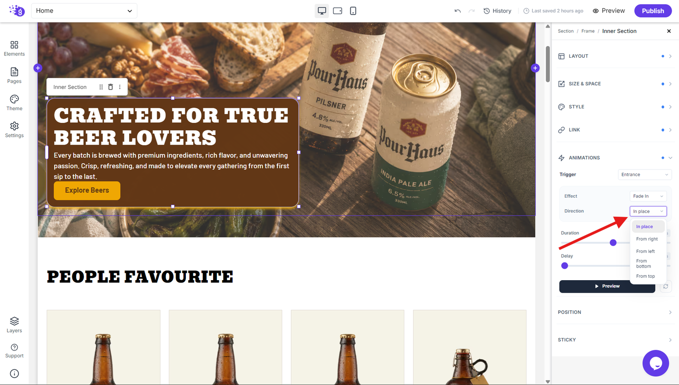
Direction
For supported effects, choose the direction from which the animation should occur. Available directions include:
In Place
From right
From left
From bottom
From top
Duration
Control how long the animation takes to complete. Adjust the duration to create faster or slower animation effects.
Delay
Set a delay before the animation begins. This allows you to control when the animation starts after its trigger is activated.
Preview
Use the Preview button to see how the selected animation will appear before applying it to your live design.
This combination of Trigger, Effect, Direction, Duration, and Delay gives you precise control over how the Inner Section enters, responds to interactions, or repeats animations throughout your page.
Advanced Settings
Positioning
Control the position of the Inner Section using the Position settings.
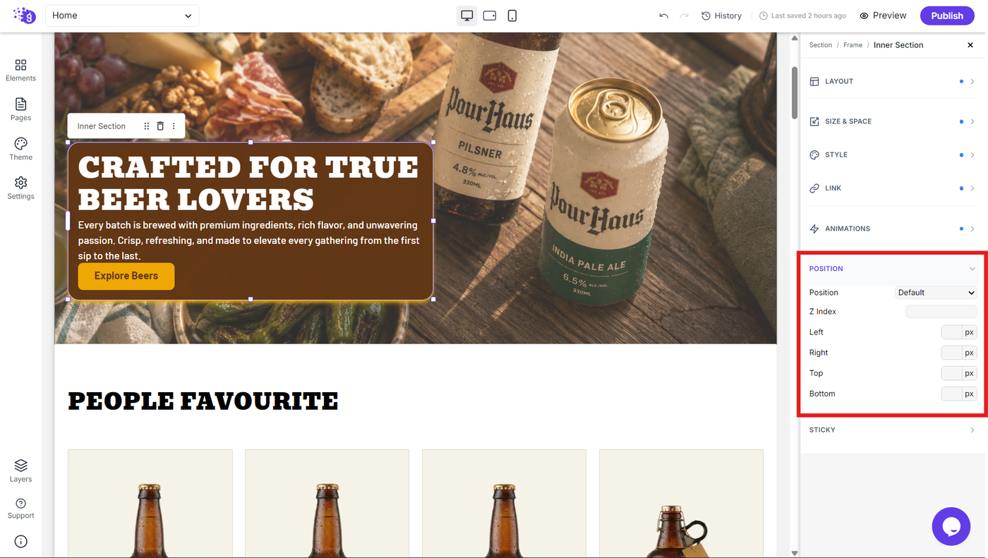
Position controls allow you to precisely place the Inner Section within its surrounding layout when more advanced positioning is required.
Sticky Behavior
The Sticky setting allows the Inner Section to remain fixed within the viewport as the visitor scrolls.
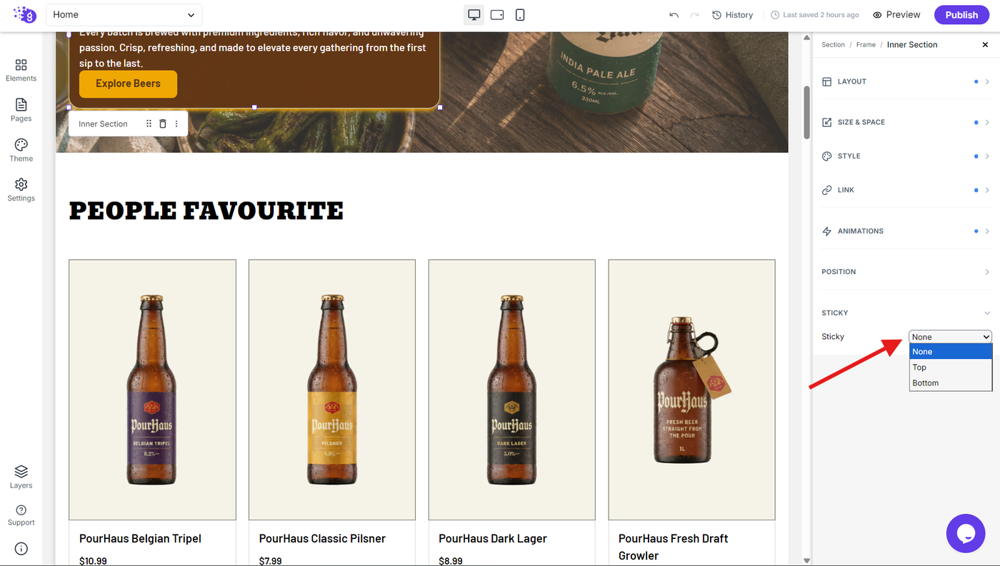
Configure the sticky behavior according to your layout requirements to keep important content visible while scrolling.
This can be particularly useful for navigation elements, supporting information, calls to action, or other content that needs to remain accessible.