The Grigora visual email composer provides a modern, distraction-free environment for designing beautiful, responsive newsletters. With modular content blocks, in-place inline editing, mobile simulation, and real-time link checks, you can craft pixel-perfect emails that look great on any device.
This guide introduces the core interface and layout of the email composer in Step 3 of the Campaign Builder.
The Composer Interface Overview
When you enter Step 3 (Design) of creating a campaign, the composer is organized into two primary workspaces:
The Left Side Panel (Blocks, Style, and AI Tabs): Located on the left side of your screen with three tabs at the top:
Blocks (
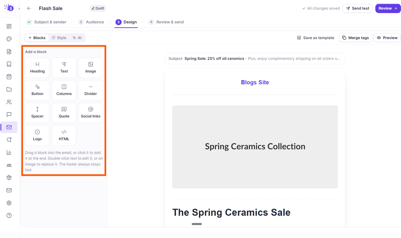
+ Blocks): Displays the modular block palette (Headings, Text, Images, Buttons, Columns, Dividers, Spacers, Quotes, Social links, Logos, and HTML). When you click any block on the canvas, this panel automatically switches to display that block's settings and property controls.Style (
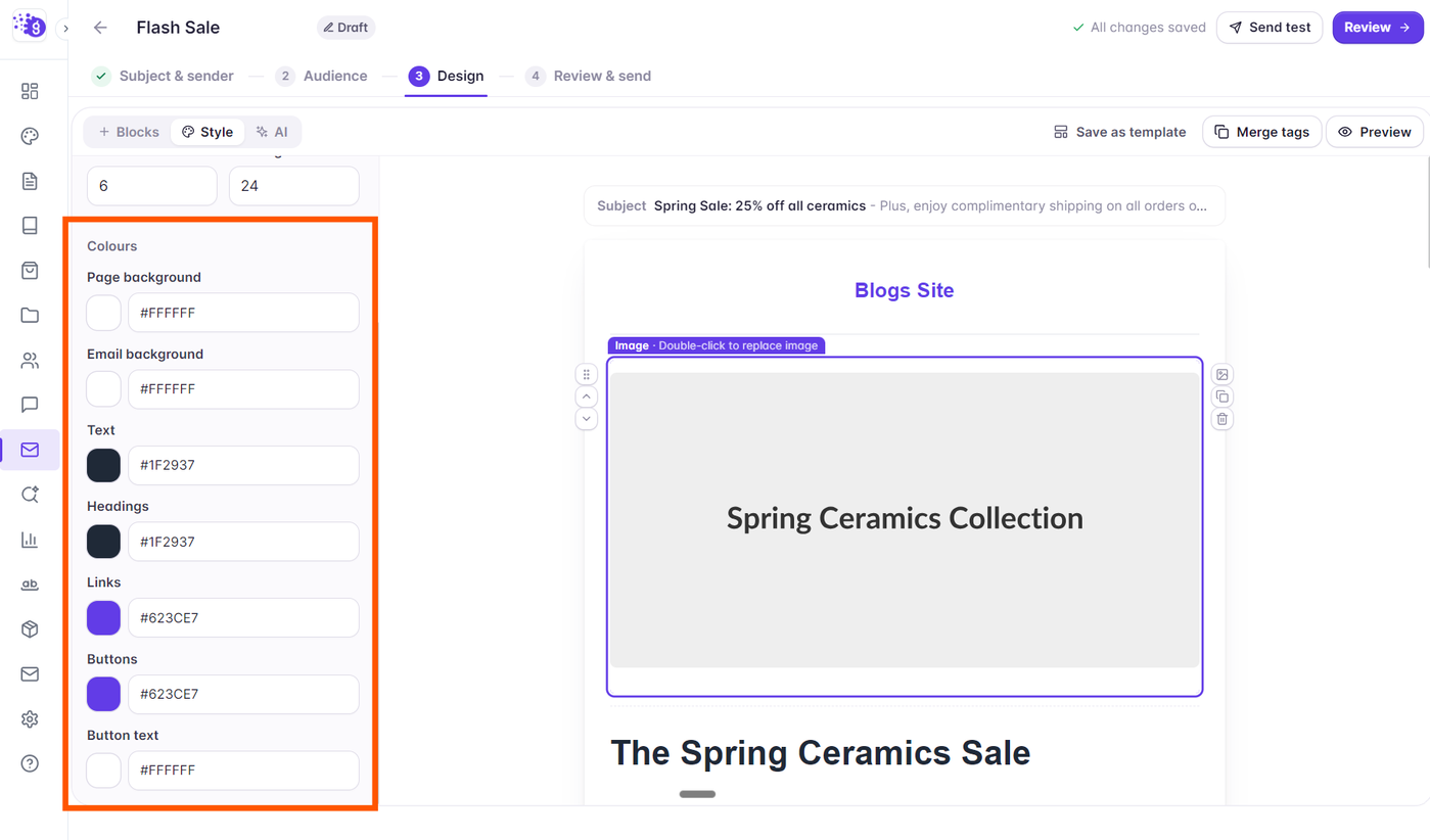
🎨 Style): Global email styling controls including canvas width, page and email background colors, default fonts, corner radius, and button styling.AI (
✨ AI): The integrated AI assistant to draft or restyle your newsletter layout using custom prompts.
The Interactive Canvas (Center): The visual canvas where your email renders in real time. You can drag and drop blocks, nudge blocks up and down, and double-click text or images to edit them directly in place.
Available Block Types
Grigora offers a comprehensive set of modular email blocks designed to render reliably across major email clients:
Heading: Semantic titles (H1, H2, H3) with customizable typography, alignment, and color.
Text: Multi-paragraph rich text powered by Quill inline bubble formatting (bold, italic, lists, hyperlinks).
Image & Logo: High-resolution banners, illustrations, and brand marks with custom widths and click-through links.
Button: Conversion-focused call-to-action buttons with customizable colors, padding, and border radius.
Columns: Multi-column layouts (2 or 3 columns) with adjustable width presets and divider handles that stack responsively on mobile.
Divider & Spacer: Subtle horizontal rules and vertical whitespace to give your content breathing room.
Social: Brand-styled icons linking to your social media profiles.
Footer: CAN-SPAM and GDPR compliant footers featuring your physical address, unsubscribe links, and copyright notice.
Quote: Callout pull-quotes with colored accent bars and author attribution.
HTML: Custom raw code block with email-safe sanitization for specialized embeds.
Adding and Reordering Blocks
You can add blocks to your newsletter in two ways:
Drag and Drop: Click and drag any block from the left palette directly onto the canvas. A purple indicator guideline highlights where the block will land. You can also drop blocks directly inside column layouts.
Single Click: Simply click any block in the palette to append it to the bottom of your current email body (the compliant footer always remains at the bottom).
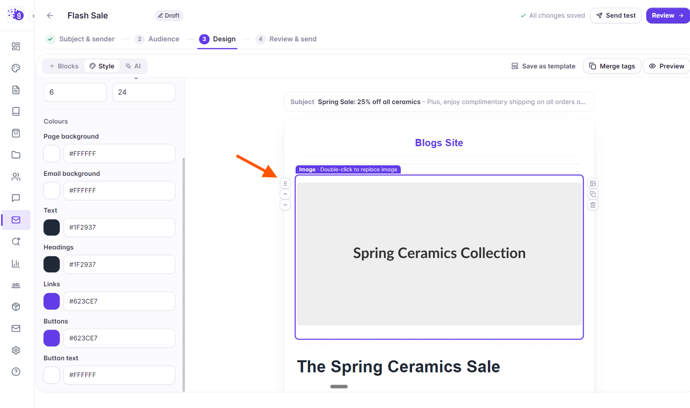
To rearrange existing blocks, hover over a block on the canvas, grab its drag handle (:::), and move it up or down. You can also use the up and down arrow buttons on the block toolbar to nudge blocks into place.
In-Place Editing Experience
Grigora uses direct in-place editing on the canvas:
Text and Headings: Double-click any text block to type directly. Selecting text reveals the Quill bubble toolbar for instant formatting. Press Esc or click outside to save.
Images and Logos: Double-click any image block to open the media picker and select or upload graphics.
Buttons: Double-click the button label on the canvas to update its text directly, while configuring its destination URL and styling in the left side panel.
Top Toolbar & Pre-Send Validation
Above the email canvas, the top toolbar provides instant access to essential campaign actions:
Save as template: Click directly to save your current email layout as a reusable template in your project gallery.
Merge tags: Click to open the merge tags reference modal and copy subscriber personalization tags (such as
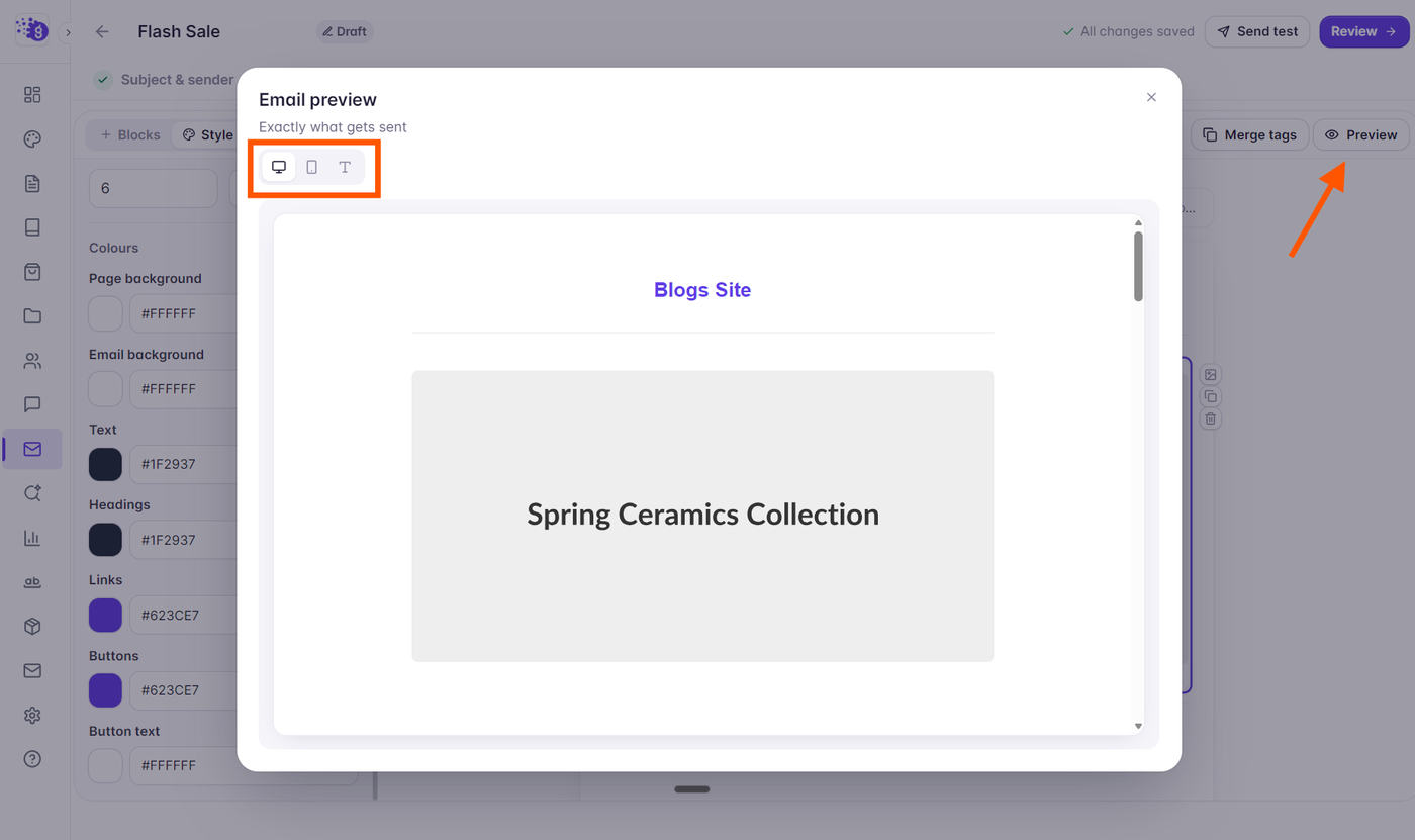
{{ contact.first_name }}).Preview: Opens the full preview modal with Desktop (600px container), Phone (375px simulator), and Plain text views.
Send test: Dispatches a real test email to up to 5 email addresses to confirm inbox appearance.
If any block contains missing links or configuration errors, an amber banner (Fix before sending:) appears directly below the toolbar with clickable links to jump straight to the affected block.