Multi-column layouts let you present information side-by-side—such as product highlights, news digests, team features, and comparison cards. In Grigora, the Columns block gives you full control over column ratios and automatically optimizes layout flow on mobile devices.
This guide explains how to add columns, adjust column width percentages, place child blocks, and configure responsive stacking.
Adding a Columns Block
Open your campaign in the Grigora visual email composer (Step 3: Design).
Locate the Columns block in the left block palette (under + Blocks).
Drag the Columns block onto the canvas, or click it to append it to your newsletter.
When selected, the left side panel displays the Columns configuration controls:
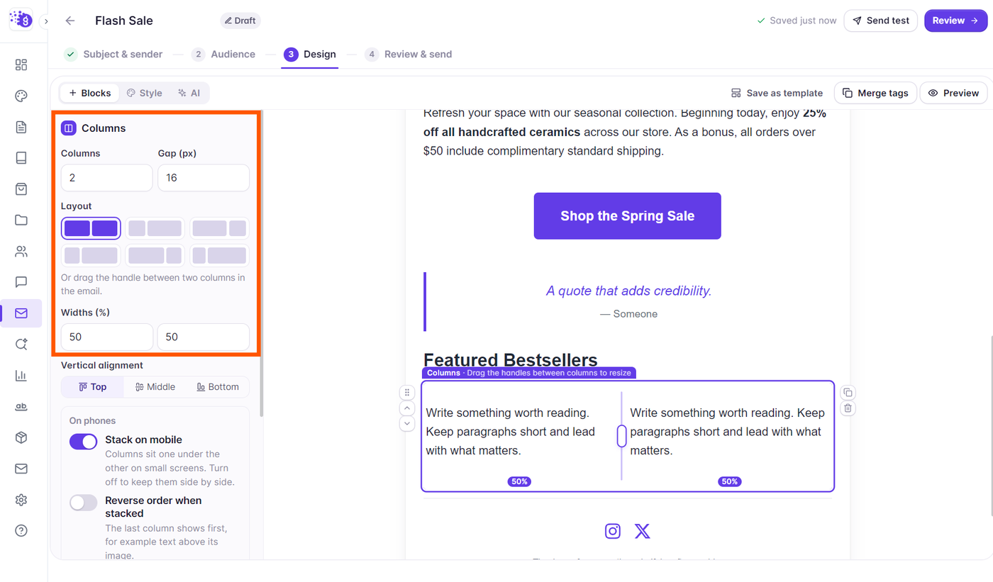
Columns: Select 2 or 3 columns from the dropdown.
Gap (px): Set the horizontal spacing between columns (0px to 48px).
Layout Presets: Choose from quick proportion presets:
2 Columns: 50% / 50%, 33% / 67%, 67% / 33%
3 Columns: 33% / 33% / 33%, 25% / 50% / 25%
Vertical alignment: Align column content to the Top, Middle, or Bottom.
Adjusting Column Widths
Beyond presets, you can customize the width ratio of each column freely:
Click on the Columns block on the canvas to select it.
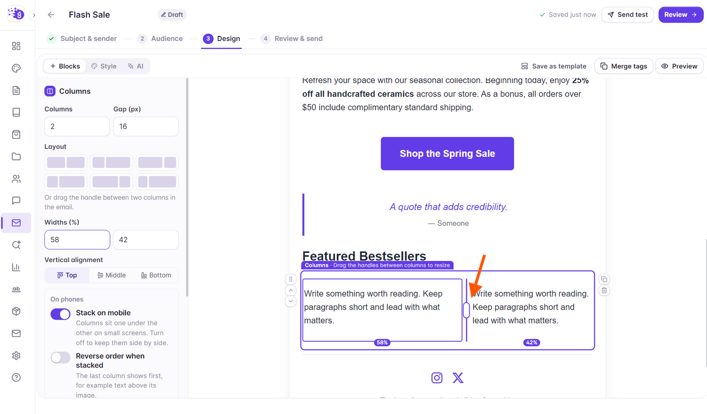
In the left side panel under Widths (%), enter custom percentage numbers for each column (the total automatically balances to 100%).
Alternatively, hover over the divider gap between two columns directly on the canvas and drag the resize handle left or right to rebalance column widths visually.
Grigora enforces a safe minimum column width to prevent text clipping and formatting collapse.
Adding Content Inside Columns
Each column functions as an independent container that can hold child content blocks:
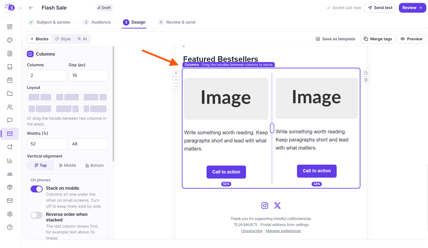
Drag any supported block (Heading, Text, Image, Button, Spacer, Divider, Social) from the left palette directly into an individual column. A purple outline highlights the target column.
You can stack multiple blocks within the same column (for instance, an Image block above a Heading block, followed by Text and a CTA Button).
To reorder blocks within a column or move a block between columns, grab its drag handle and drop it into the desired position.
Mobile Responsive Stacking Controls
Email screens on smartphones are typically too narrow to display multiple columns comfortably side-by-side. The Columns block includes responsive controls in the left side panel under On phones:
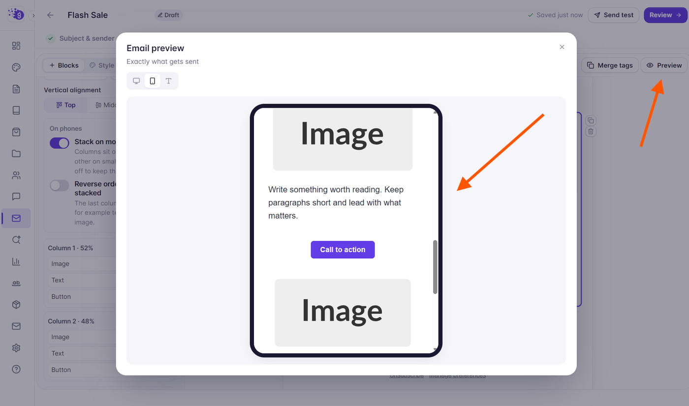
Stack on mobile: Enabled by default so columns sit one under the other on small screens for optimal legibility. You can turn this toggle off if you prefer to keep columns side-by-side.
Reverse order when stacked: Reverses the display order when stacked (for example, displaying a product image above its text description when alternating layout cards).
Click the Preview button in the top toolbar and switch to the Phone tab to inspect the stacked layout before sending.